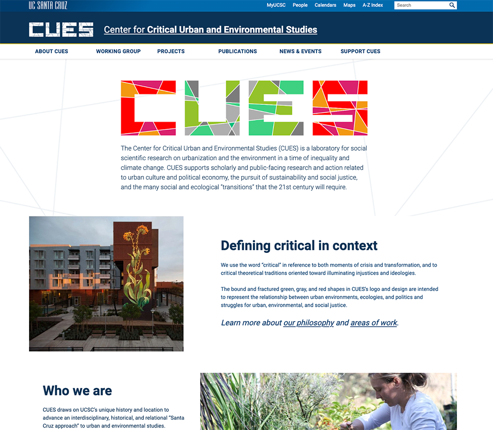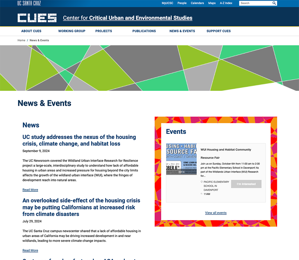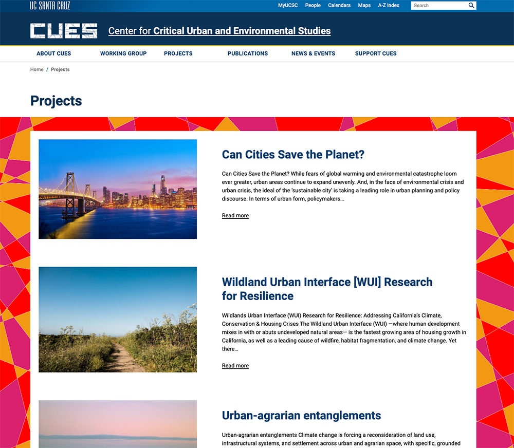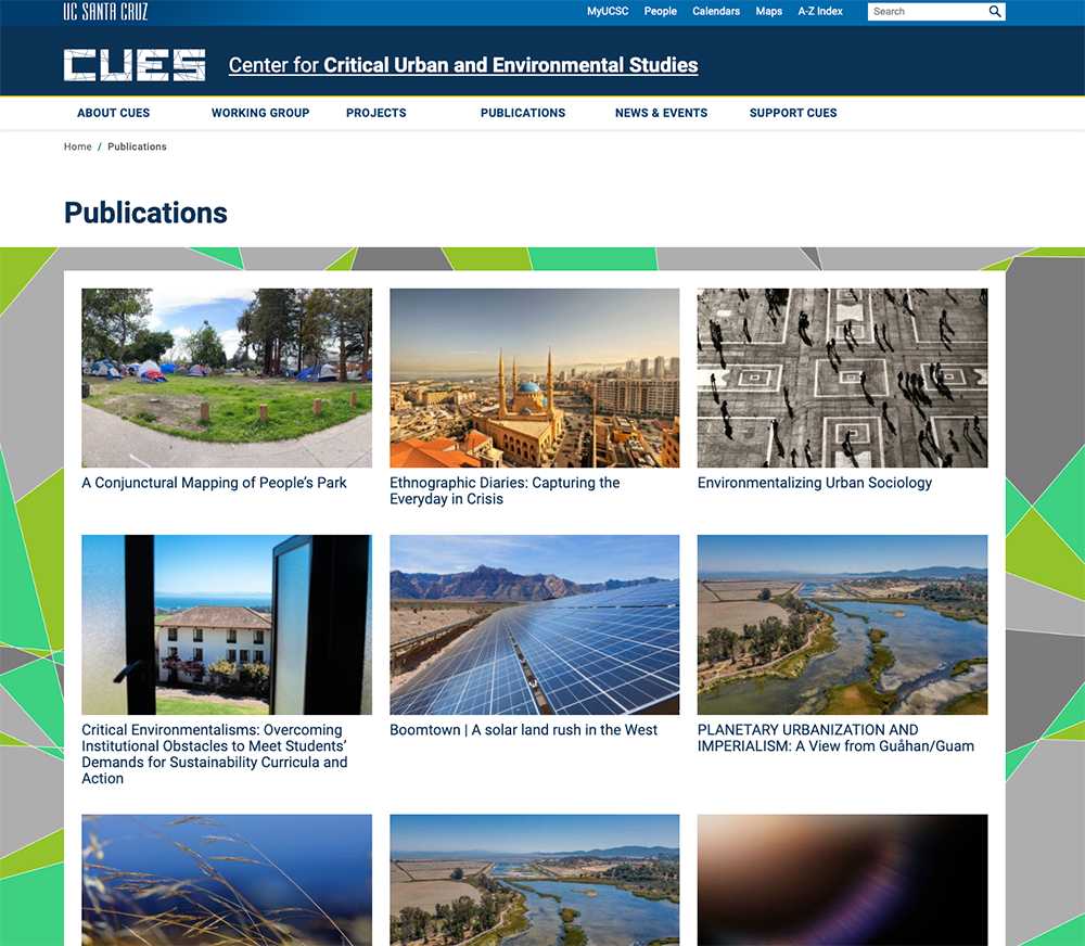
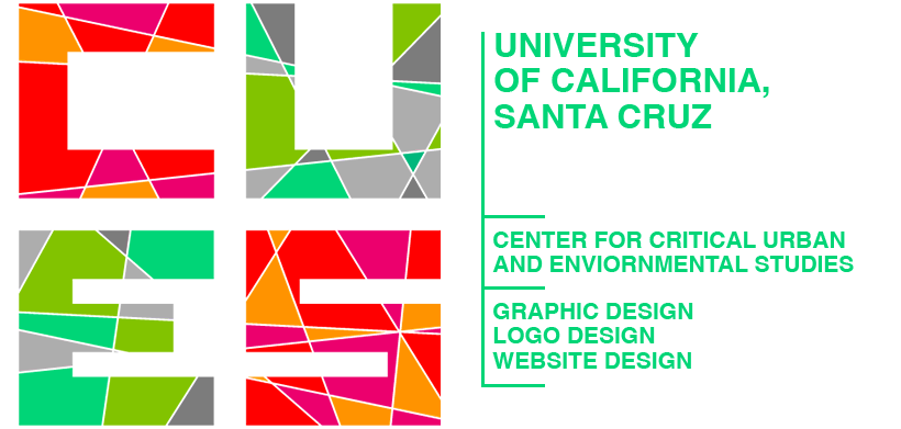
The Center for Critical Urban and Environmental Studies (CUES) was a newly formed UCSC research center — no visual identity, no style system, starting from zero. The brief was to create a logo that could hold the tension between the urban and the environmental, feel intellectually serious, and still fit within UCSC's broader brand guidelines. I developed a mark built on geometric shards to represent that collision of forces, then took it further: extending the letterforms into a full custom alphabet for use in headers and sub-elements, and using the shard shapes as photo overlay treatments to unify the entire website visual system.

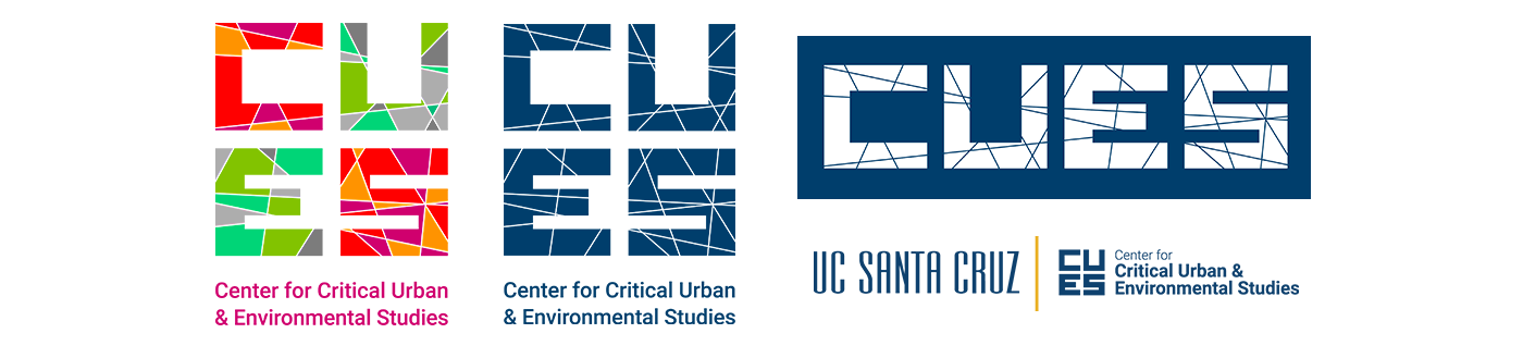
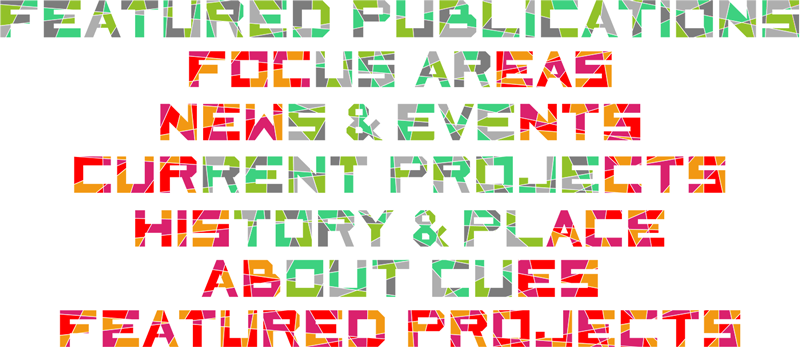

Elements of the logo was used throughout the website. Below are some samples, or click here to view the live CUES Website