Some client relationships go deeper than a single project. My work with UC Santa Cruz's Center for Critical Urban and Environmental Studies began with a logo and grew into something much larger — a years-long creative partnership spanning brand identity, research publications, community events, scientific illustration, and interactive displays. The through-line across all of it is the same: making complex research feel accessible, urgent, and human.

CUES — BRAND IDENTITY
Client: UC Santa Cruz — Center for Critical Urban and Environmental Studies
Product: Logo, custom typeface, photo overlay system, website
Product: Logo, custom typeface, photo overlay system, website
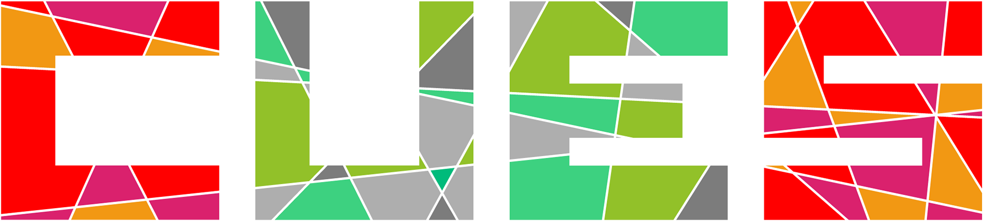
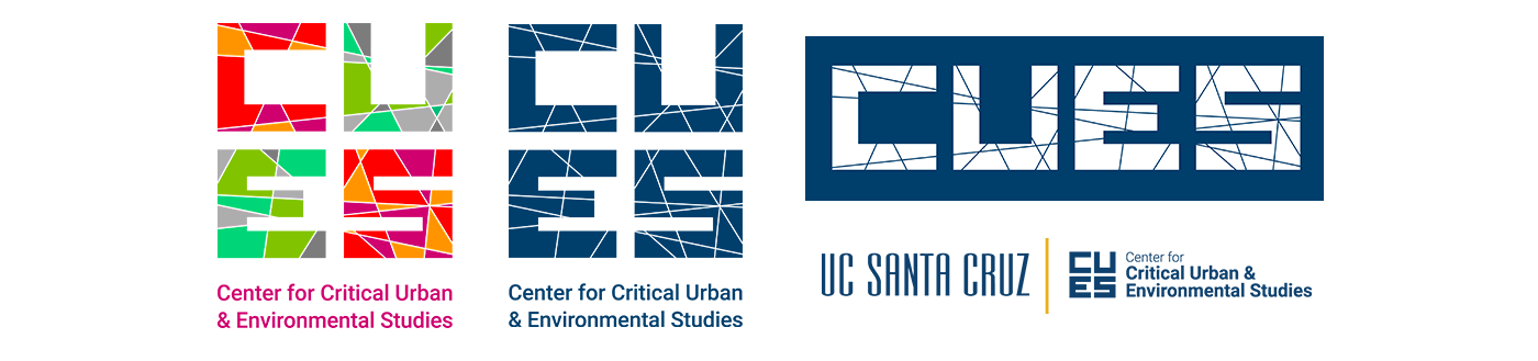
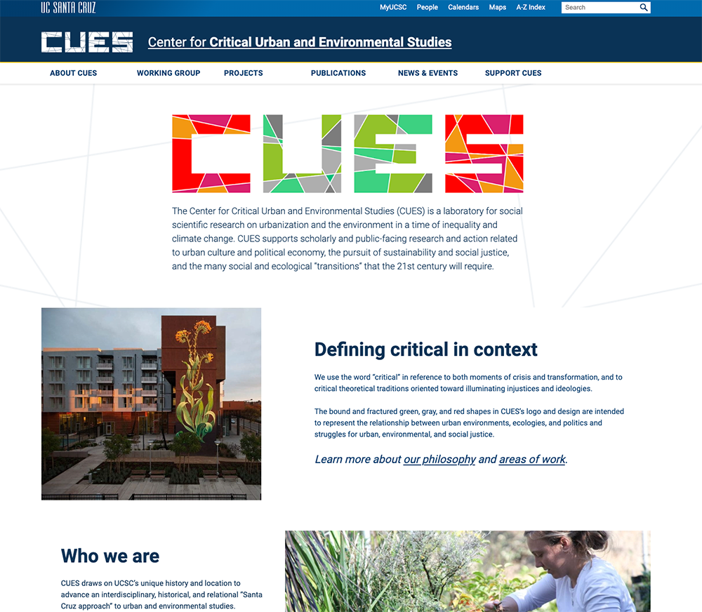
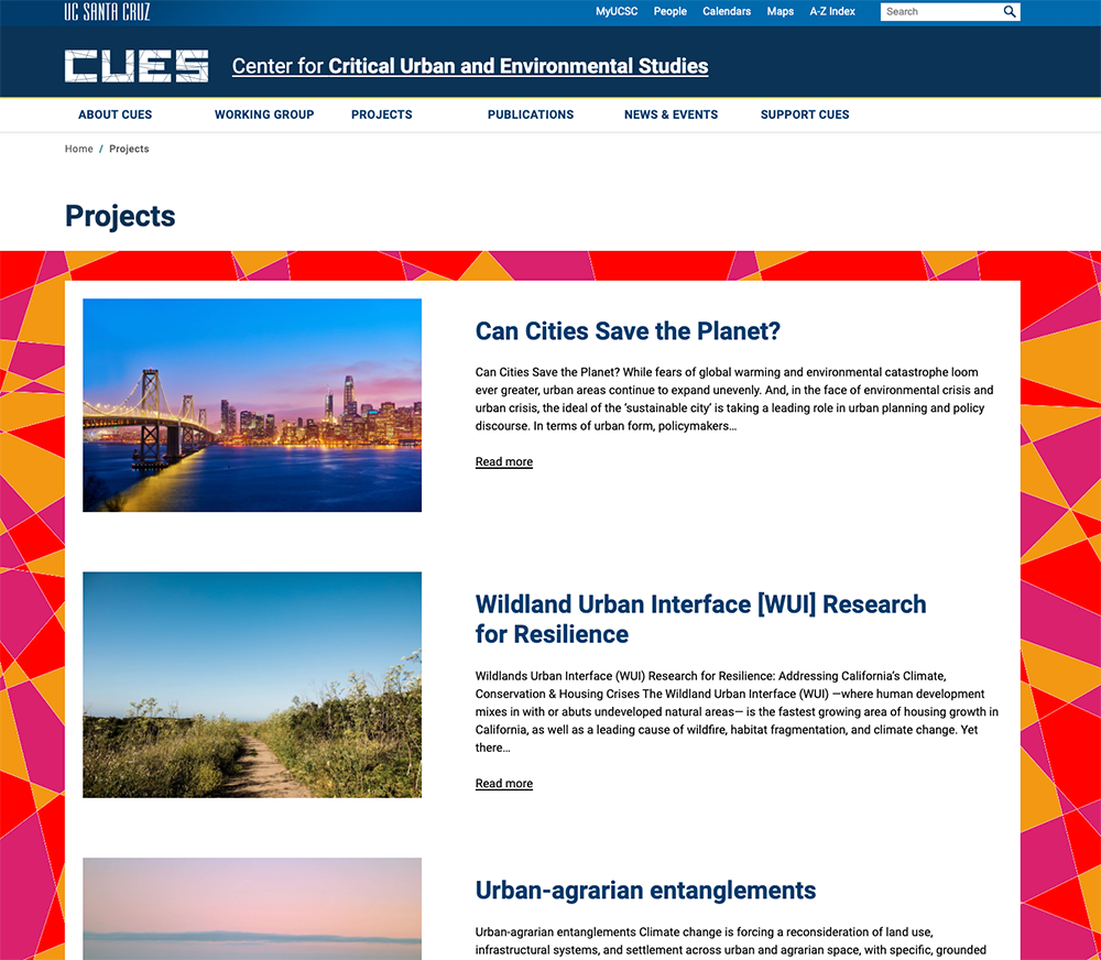
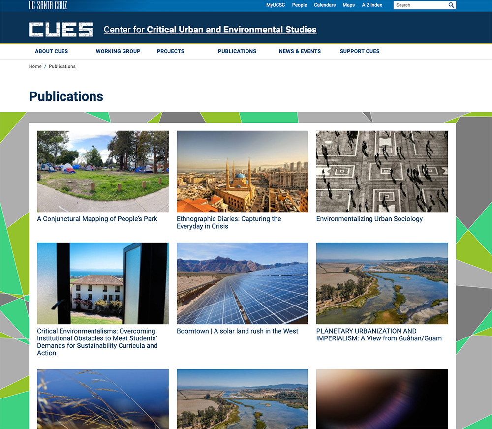
CUES was a newly formed research center with no visual identity and a complex mission — social scientific research on urbanization and the environment in a time of inequality and climate change. Starting from zero, I developed a logo built on geometric shards to represent the collision of urban and natural forces, designed to feel intellectually serious while staying within UCSC's broader brand guidelines.
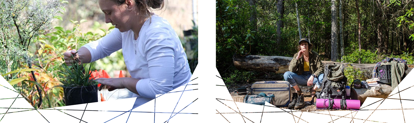
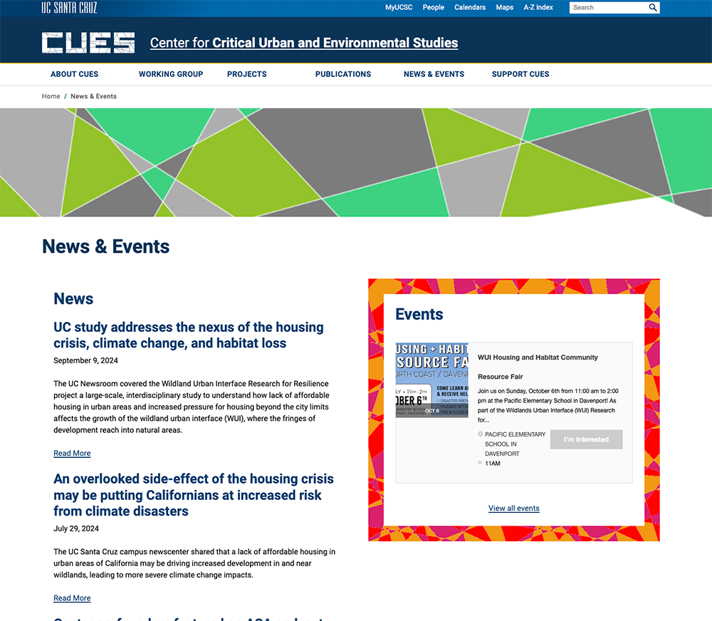
From there the project grew. I extended the letterforms into a complete custom alphabet for use in headers and sub-elements across the site. The shard shapes became a photo overlay system that unified the website visually, giving every page a consistent, ownable look. What started as a logo commission became a full visual identity system.

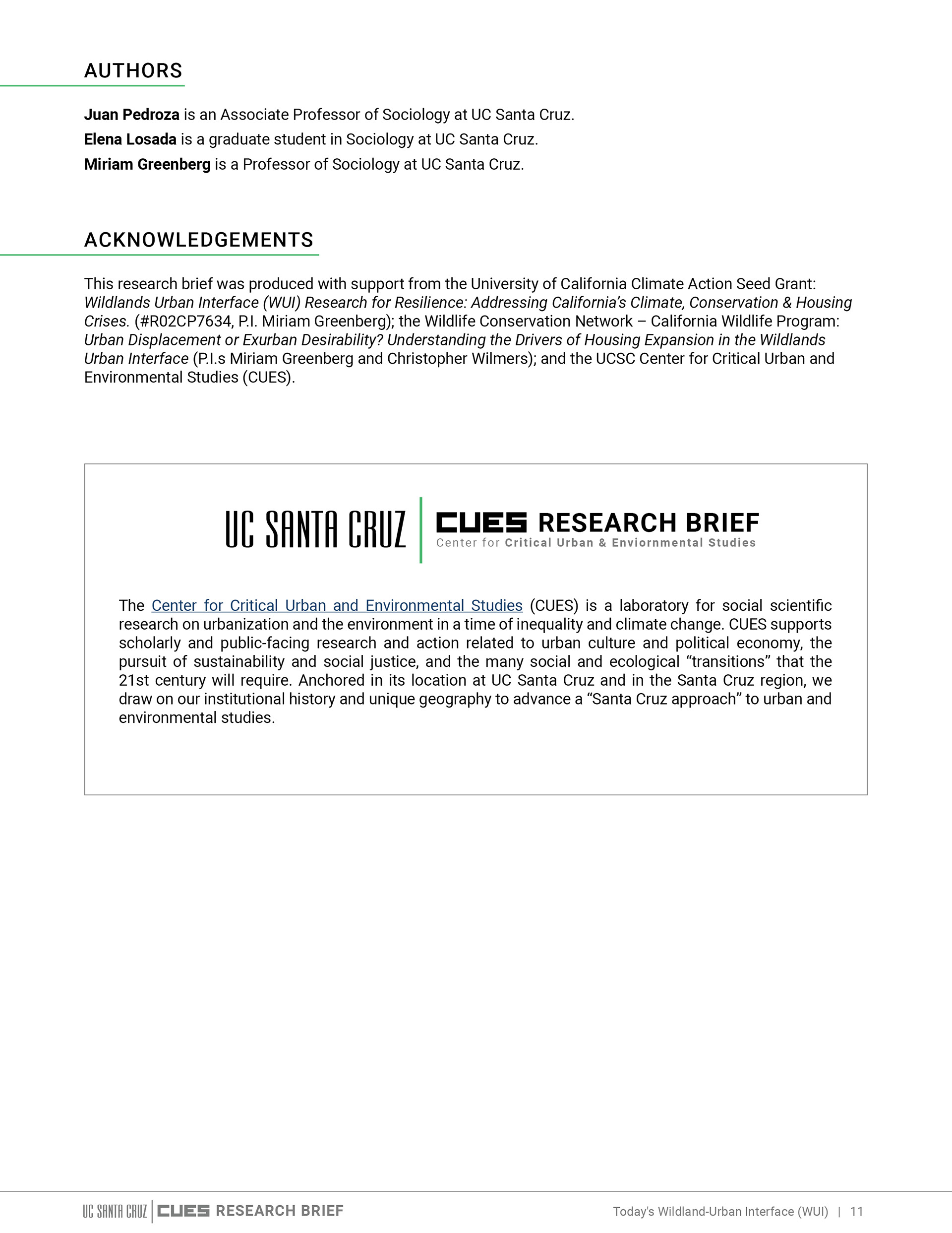
WUI RESEARCH BRIEFS
Client: UC Santa Cruz — CUES / Wildland Urban Interface Project Product: Academic research briefs designed for public readability
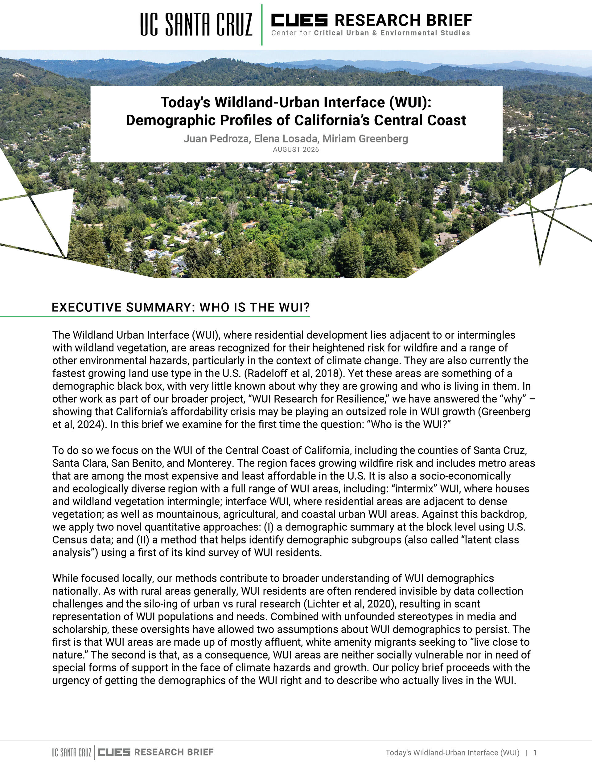
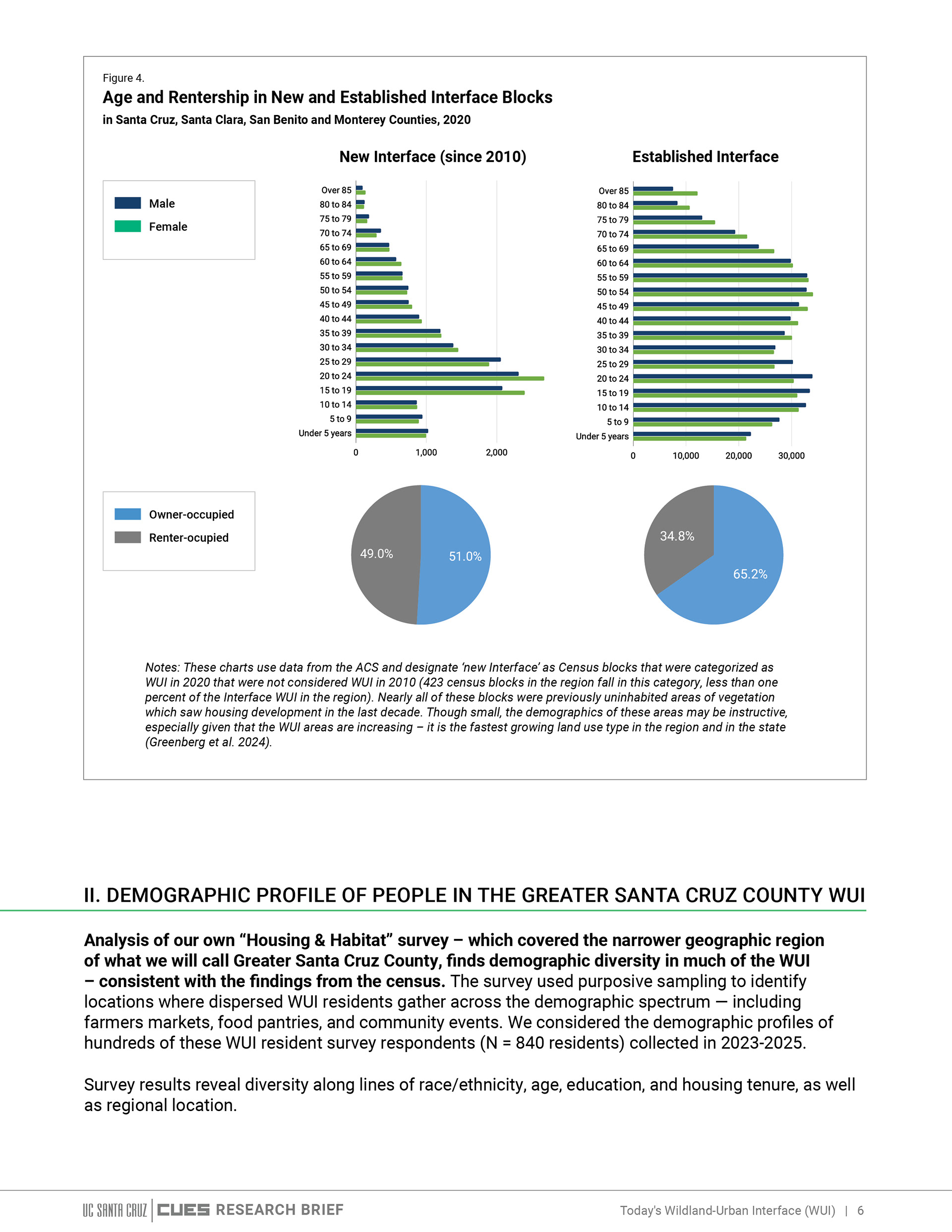
The Wildland Urban Interface — where residential development meets wildland vegetation — is one of California's fastest-growing and most environmentally precarious land use types. CUES researchers studying the WUI needed their findings to reach beyond academic audiences and into the communities most affected by wildfires, floods, and housing pressures.
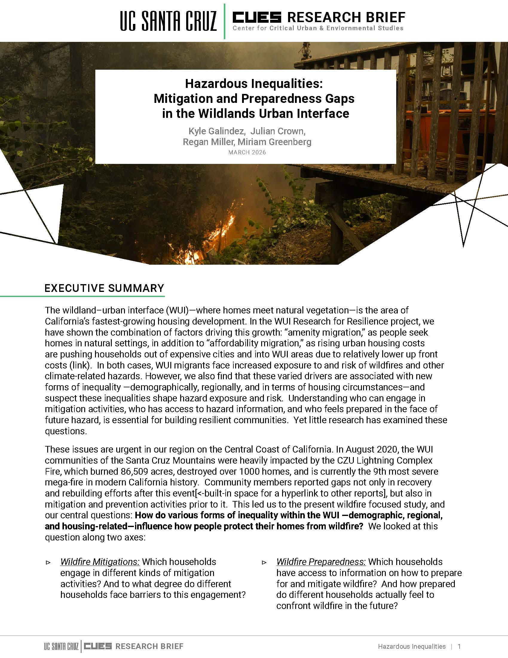
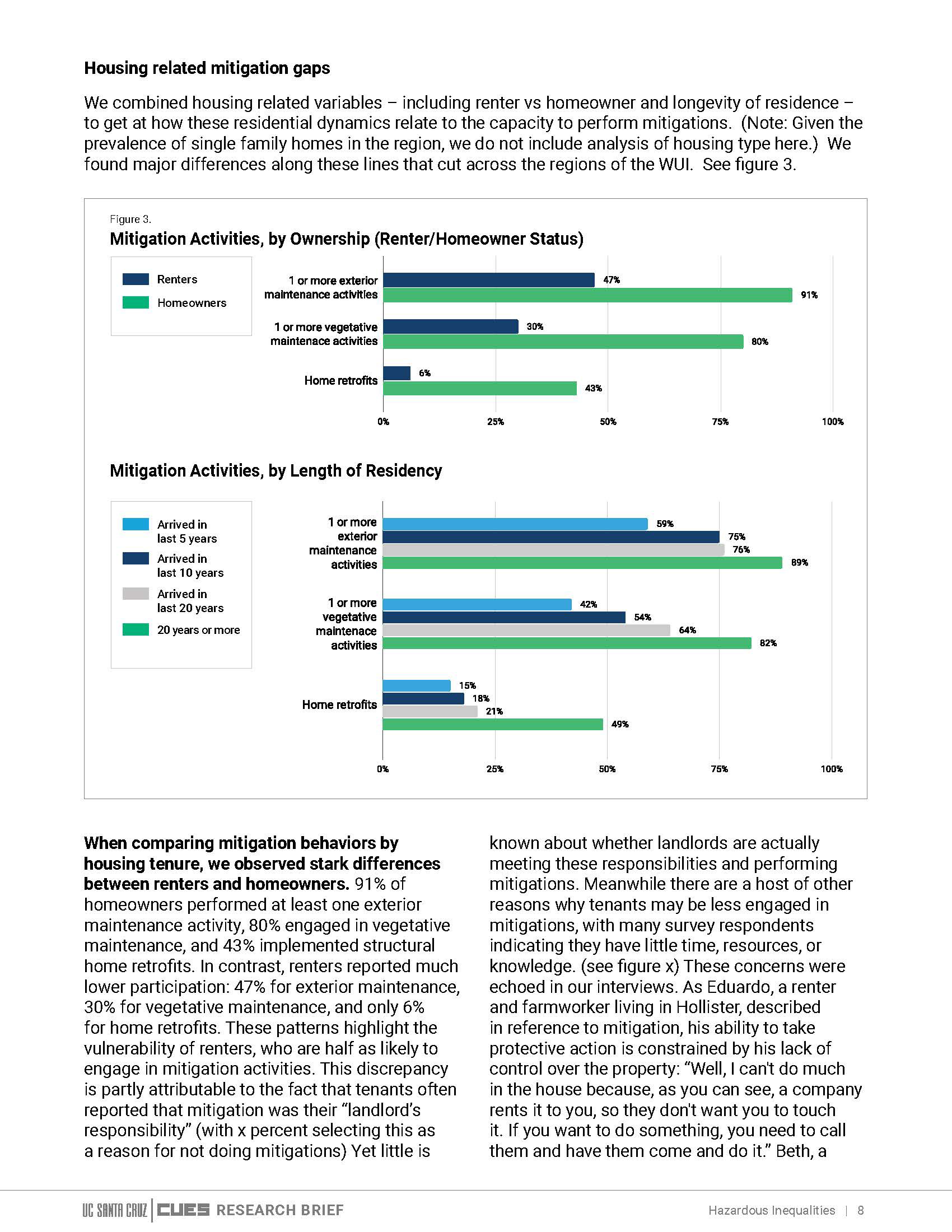
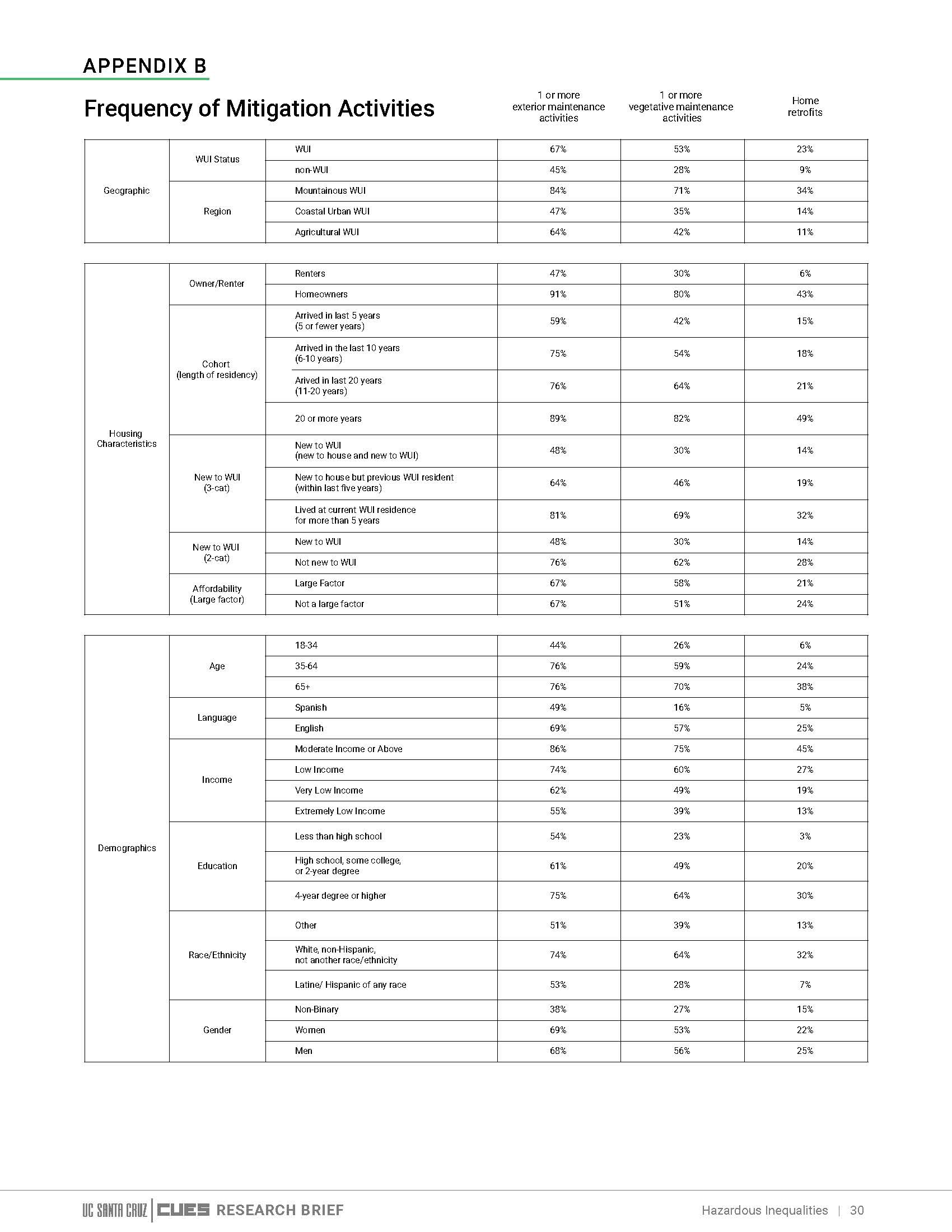
I designed a series of research briefs that translate dense sociological data into clear, readable documents — built on the CUES visual system, and structured to guide a general reader through complex findings without losing the rigor of the underlying research.

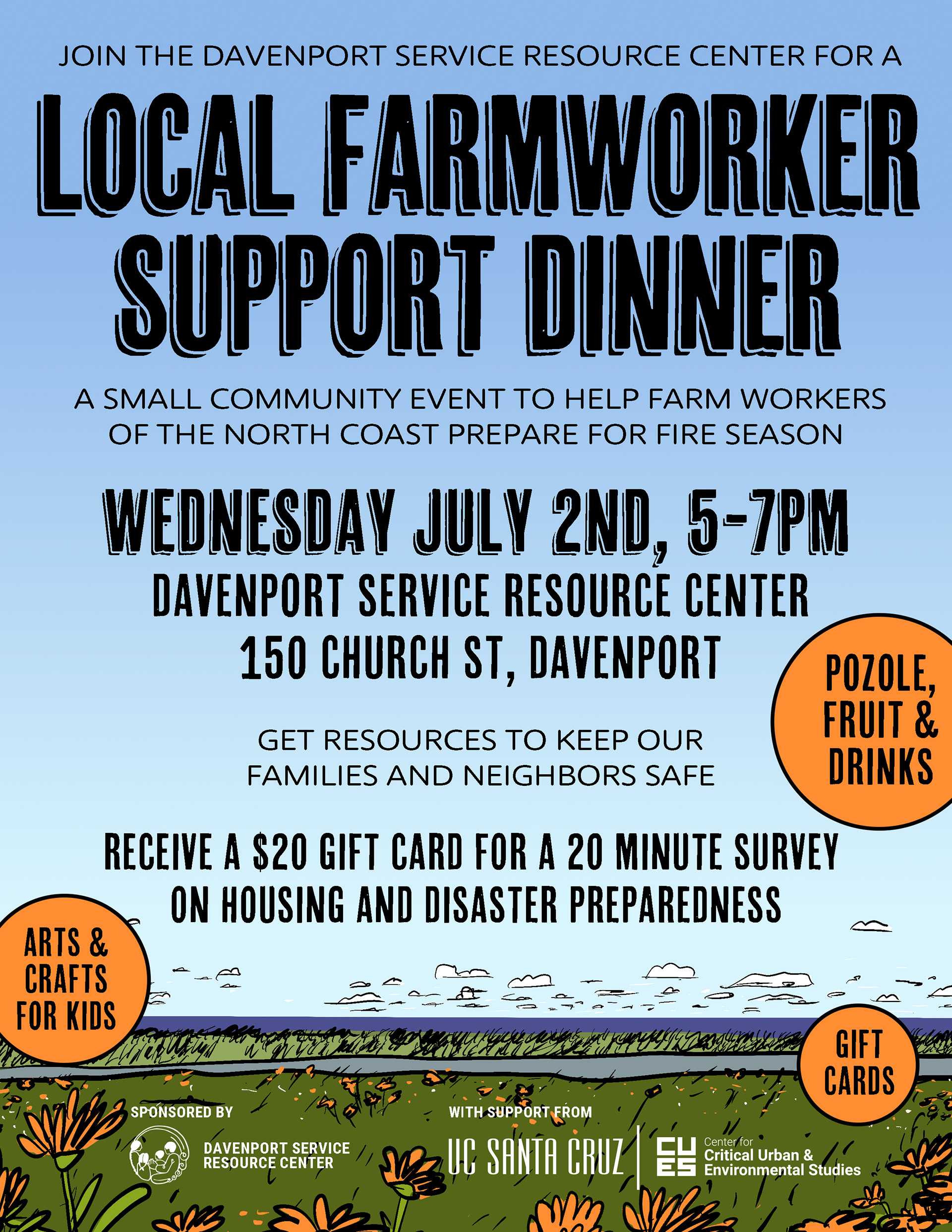
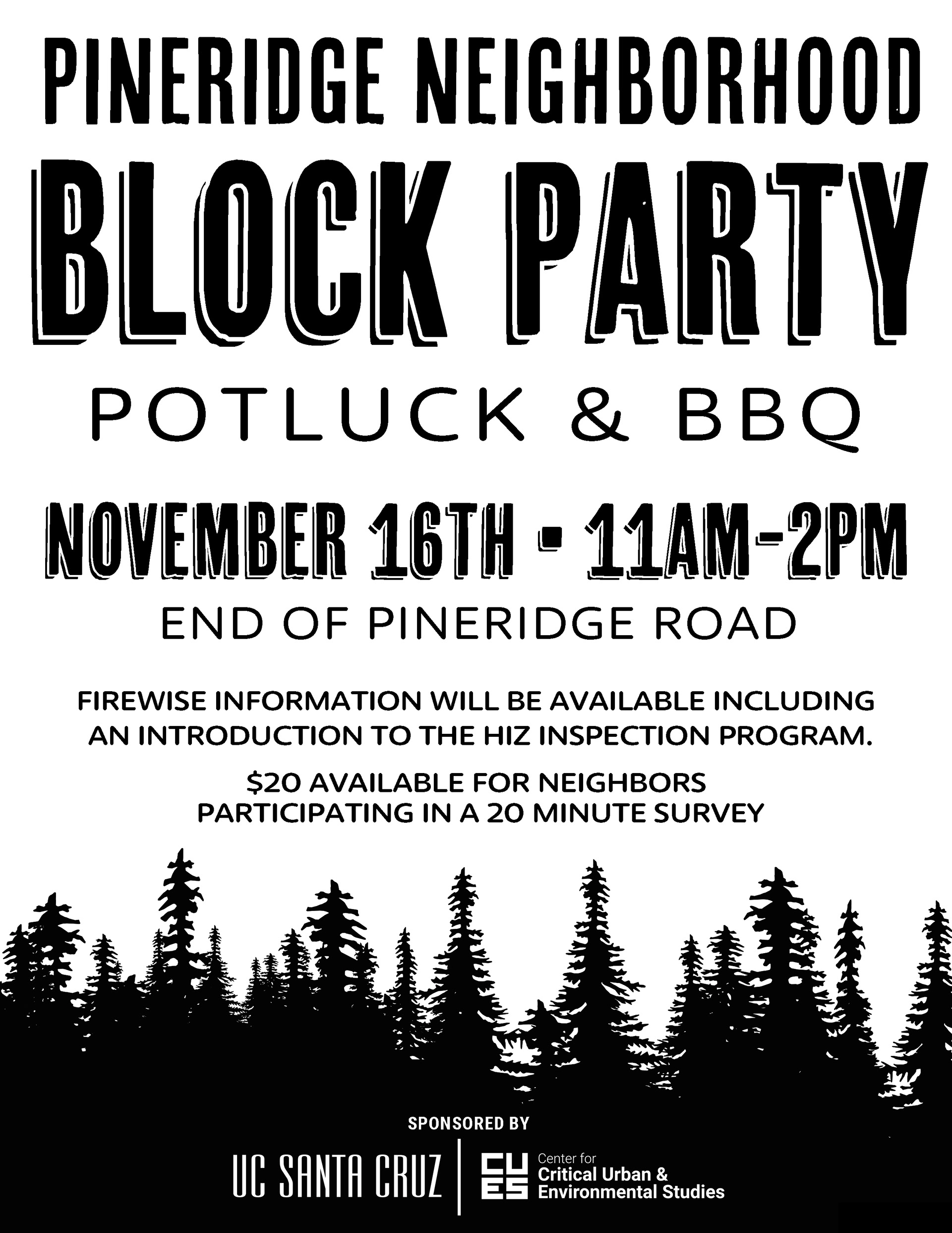
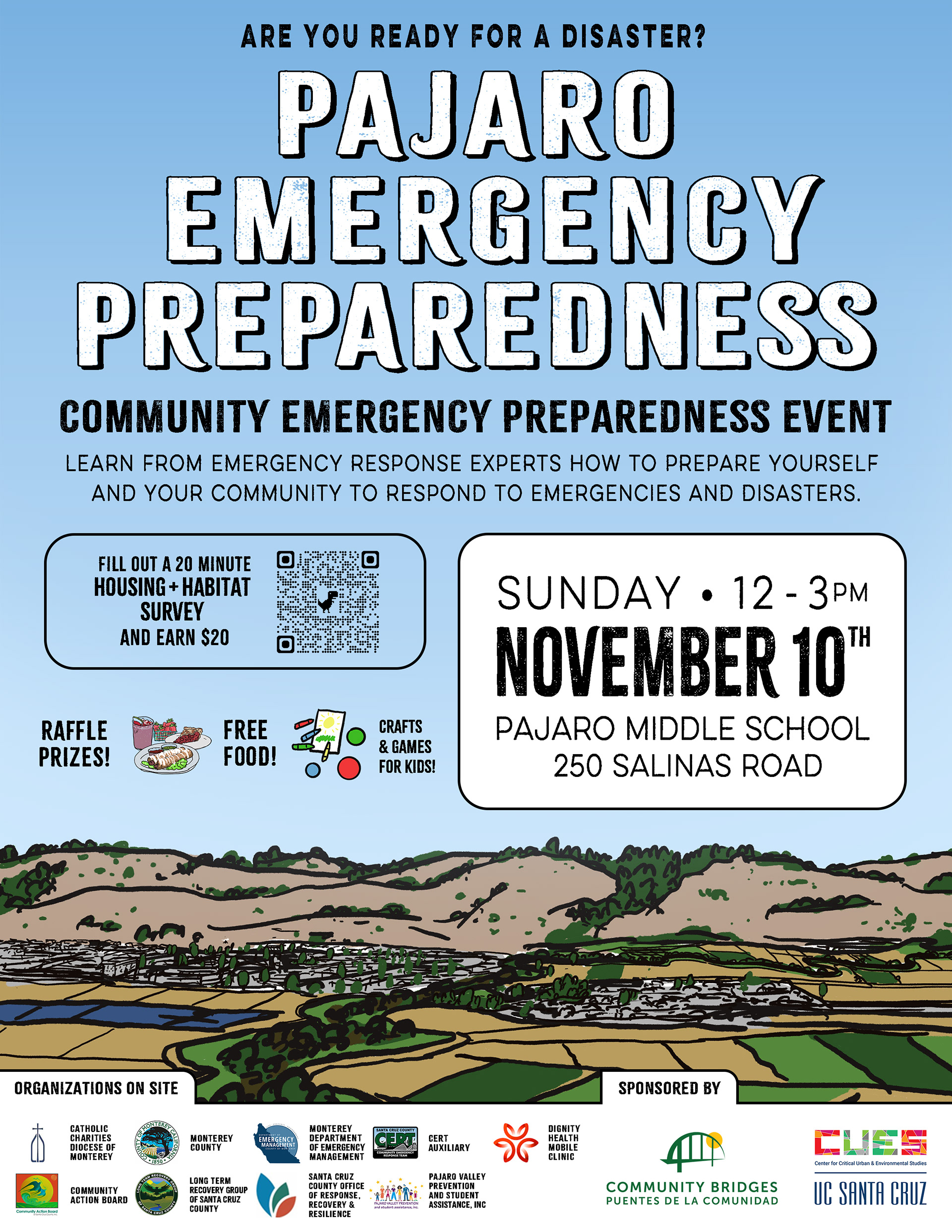
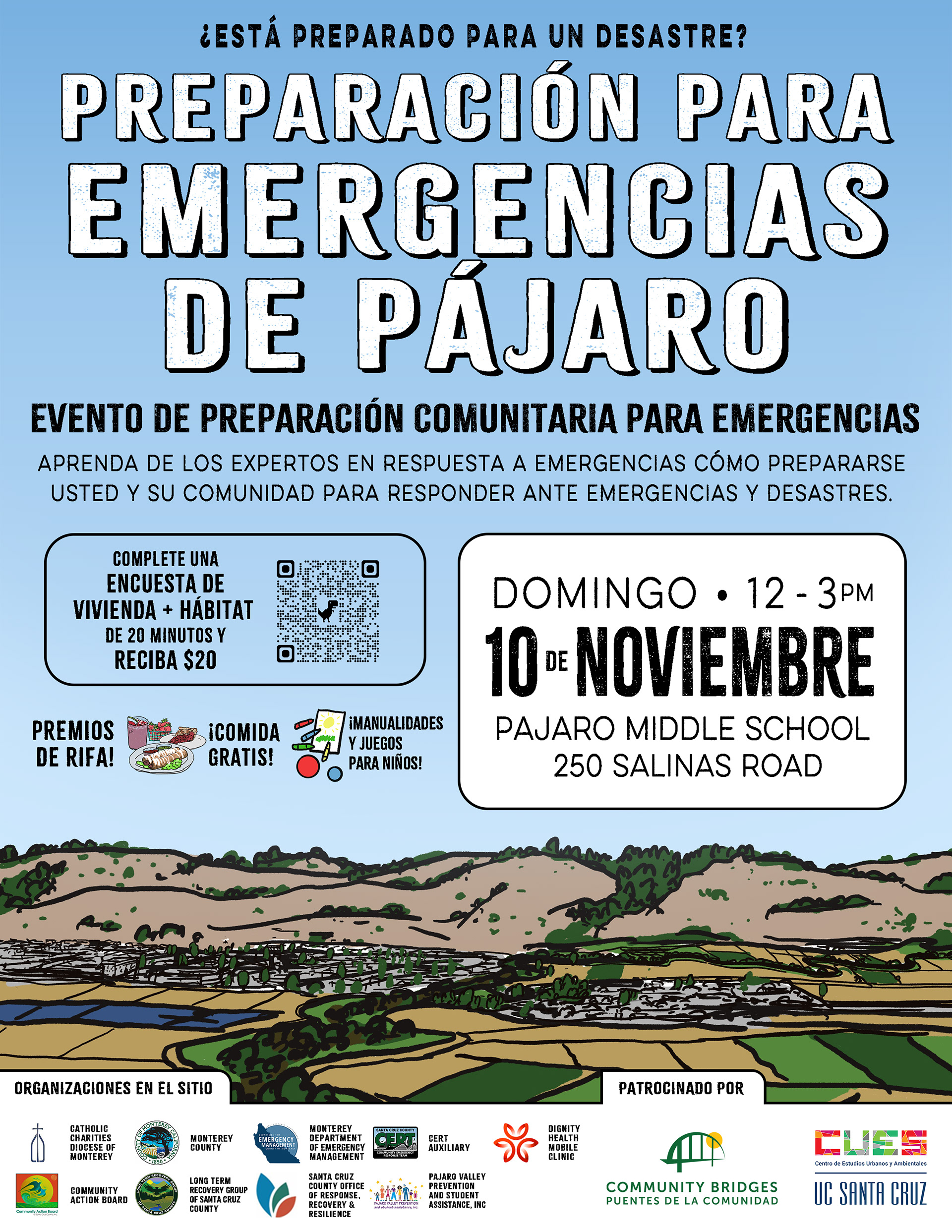
HOUSING & HABITAT EVENT POSTERS
Client: UC Santa Cruz — CUES / WUI Project
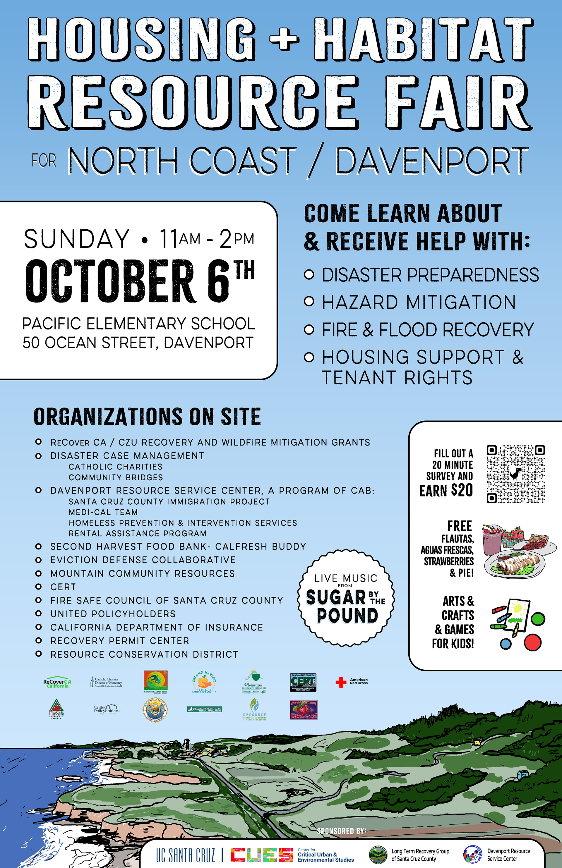
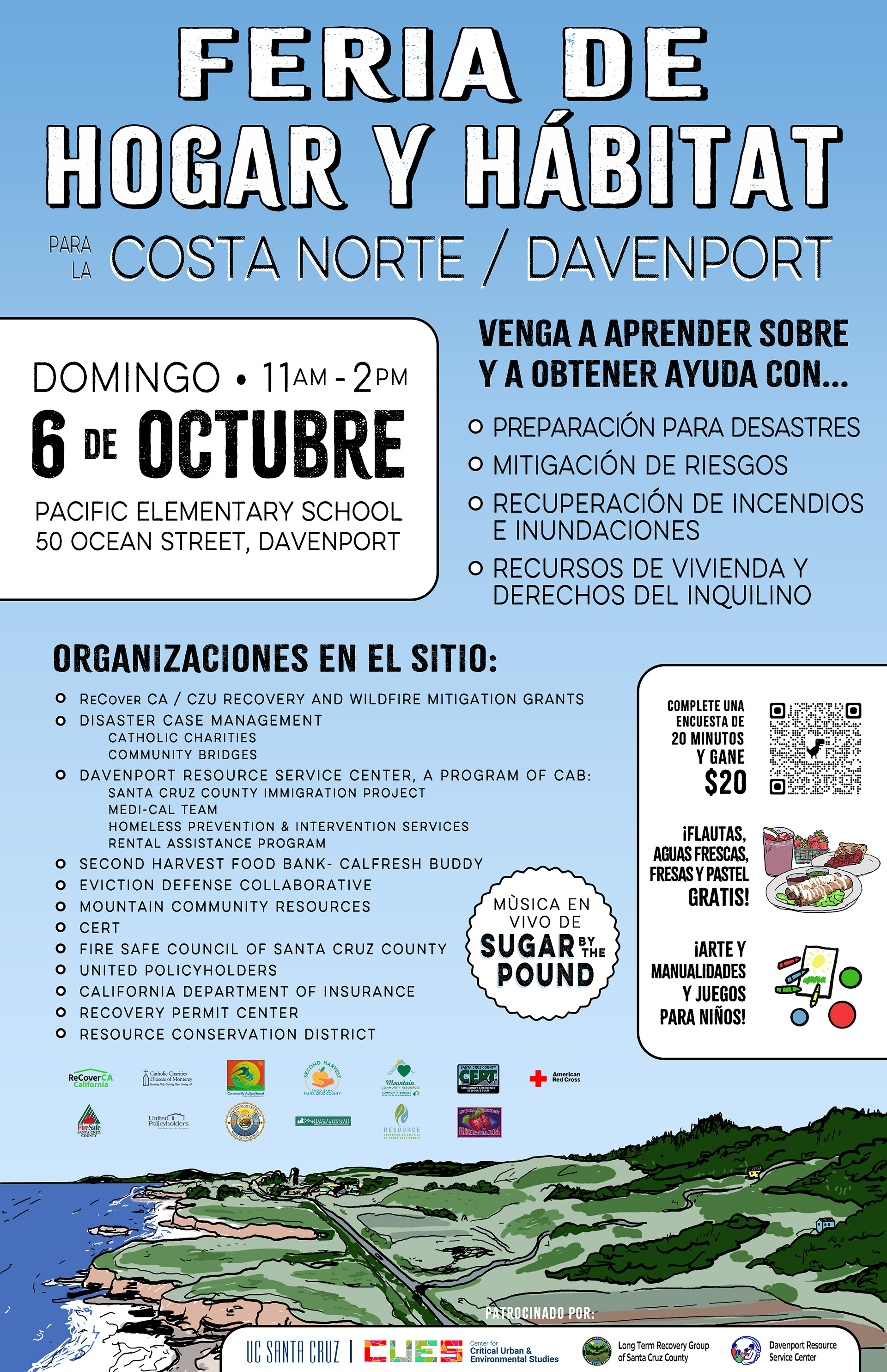
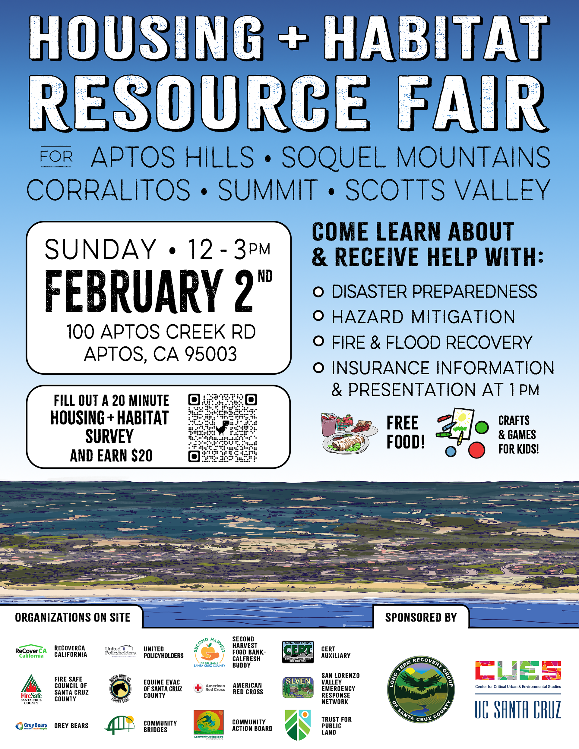
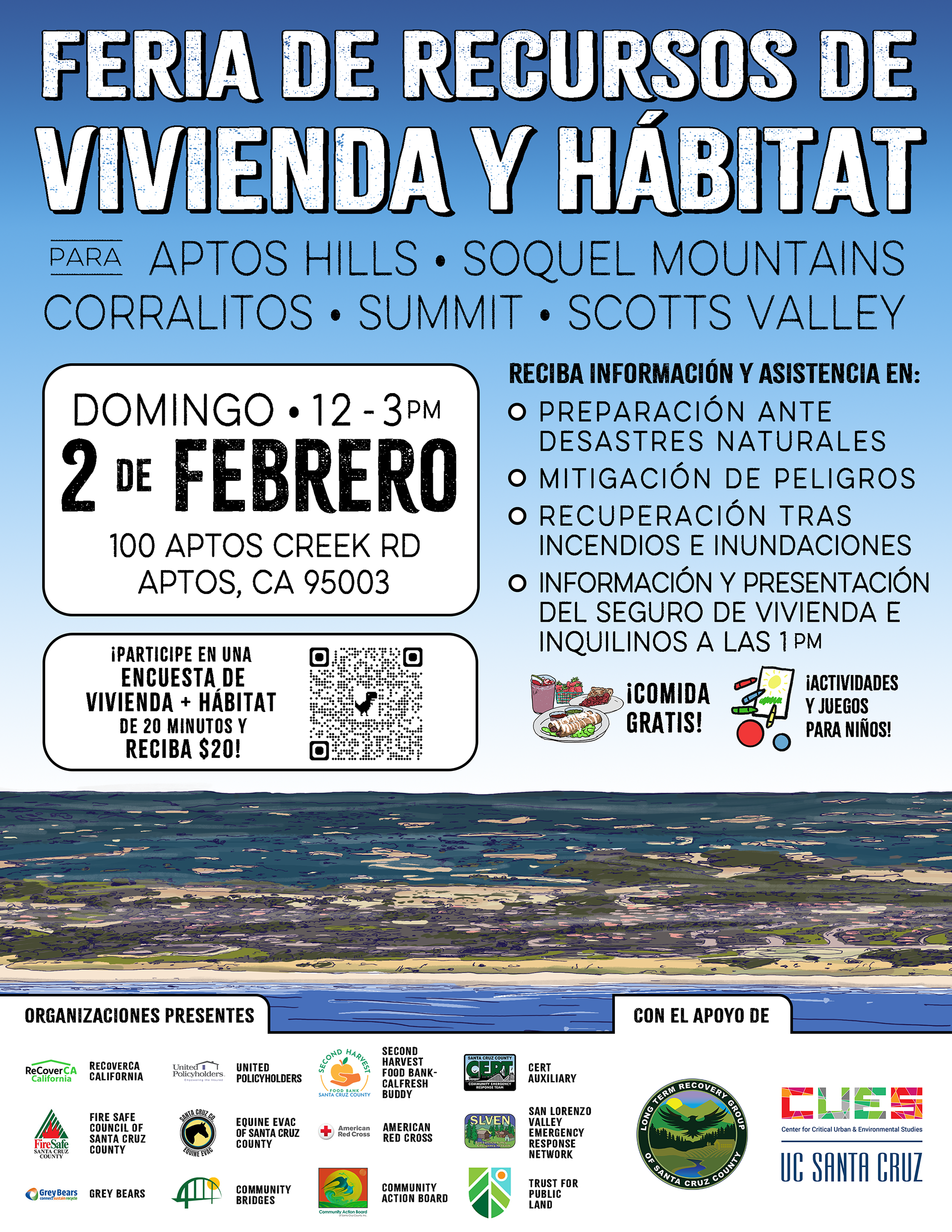
Product: Bilingual community event posters, multiple formats and locations
Product: Bilingual community event posters, multiple formats and locations
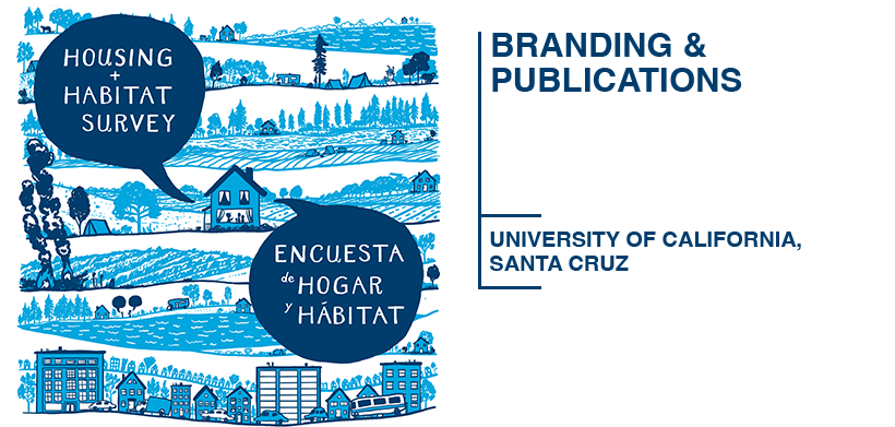
The Housing & Habitat Resource Fairs brought CUES researchers directly into WUI communities — Davenport, Aptos, Pajaro, San Lorenzo Valley — offering residents information on disaster preparedness, hazard mitigation, fire and flood recovery, and housing rights. I designed the full poster campaign for each event, working bilingually in English and Spanish across multiple formats including large-format 24x36 prints, social media sizes, and flyers.
The landscape illustration at the bottom of each poster — showing the coastal terrain where these communities actually live — is original work, drawn to give each poster a sense of place and visual warmth that a purely typographic design couldn't achieve. Each location's materials were adapted from the same system while feeling specific to that community.

COMMUNITY ENGAGEMENT & INFOGRAPHICS
Client: UC Santa Cruz — CUES / WUI Project
Product: Illustrated bilingual infographic and interactive display system for community research events
Product: Illustrated bilingual infographic and interactive display system for community research events
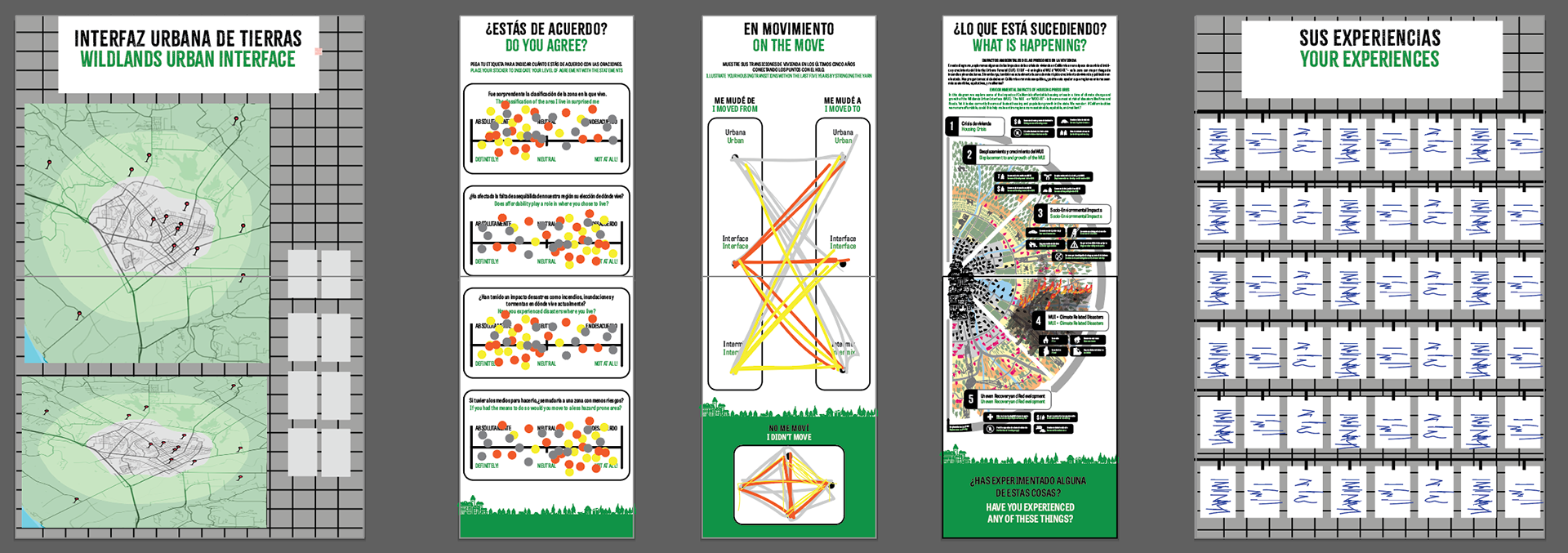
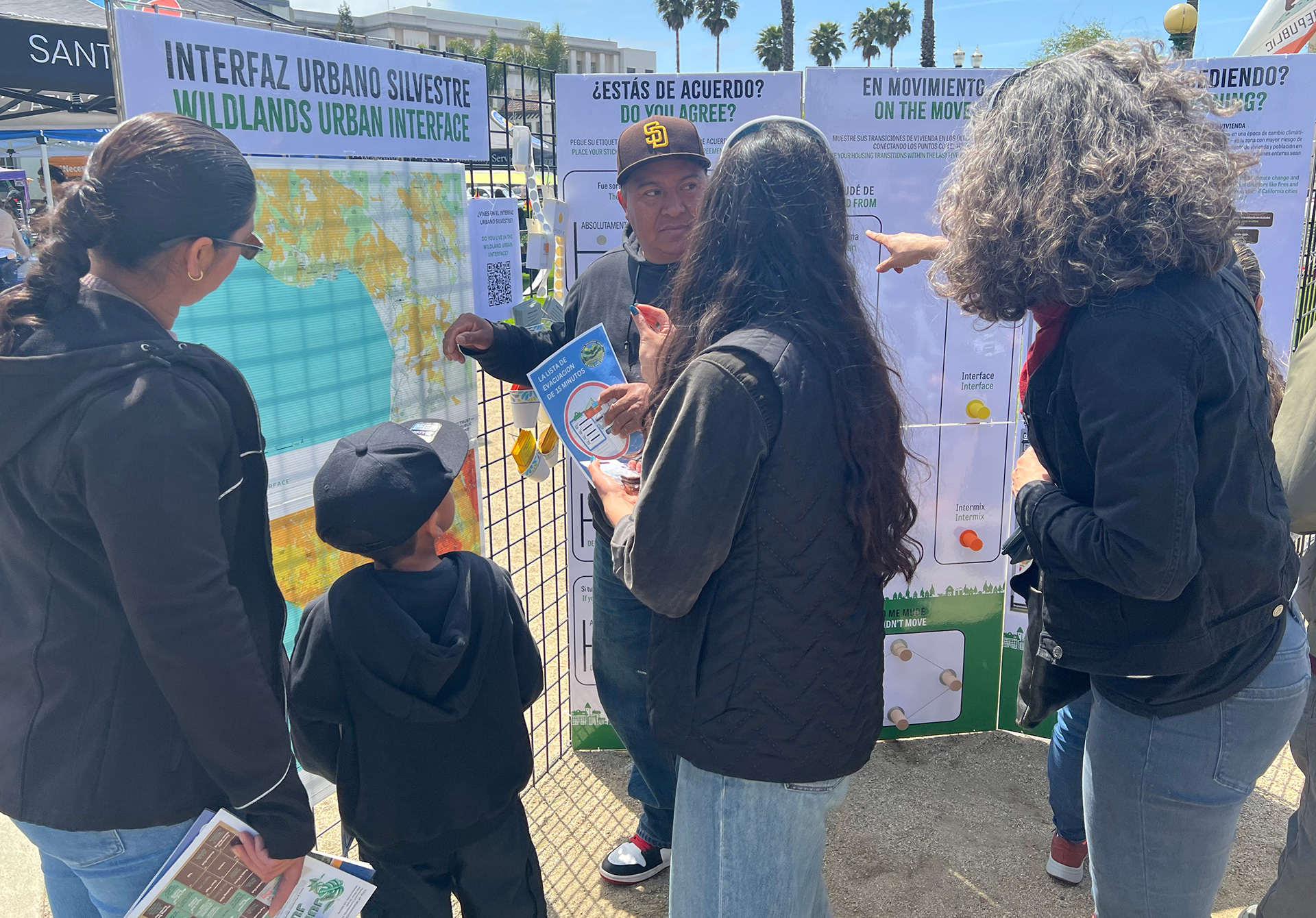
The Housing & Habitat fairs weren't just presentations — they were two-way conversations between researchers and the communities they were studying. My job was to design the materials that made those conversations possible.
The conceptual diagram was the starting point — an illustrated bilingual infographic explaining the chain from housing crisis to WUI growth to socio-environmental impact to disaster vulnerability to uneven recovery. I developed both the information architecture and the visual language from scratch, with an illustrated landscape anchoring the whole thing spatially. A horizontal version was produced for the live event format.
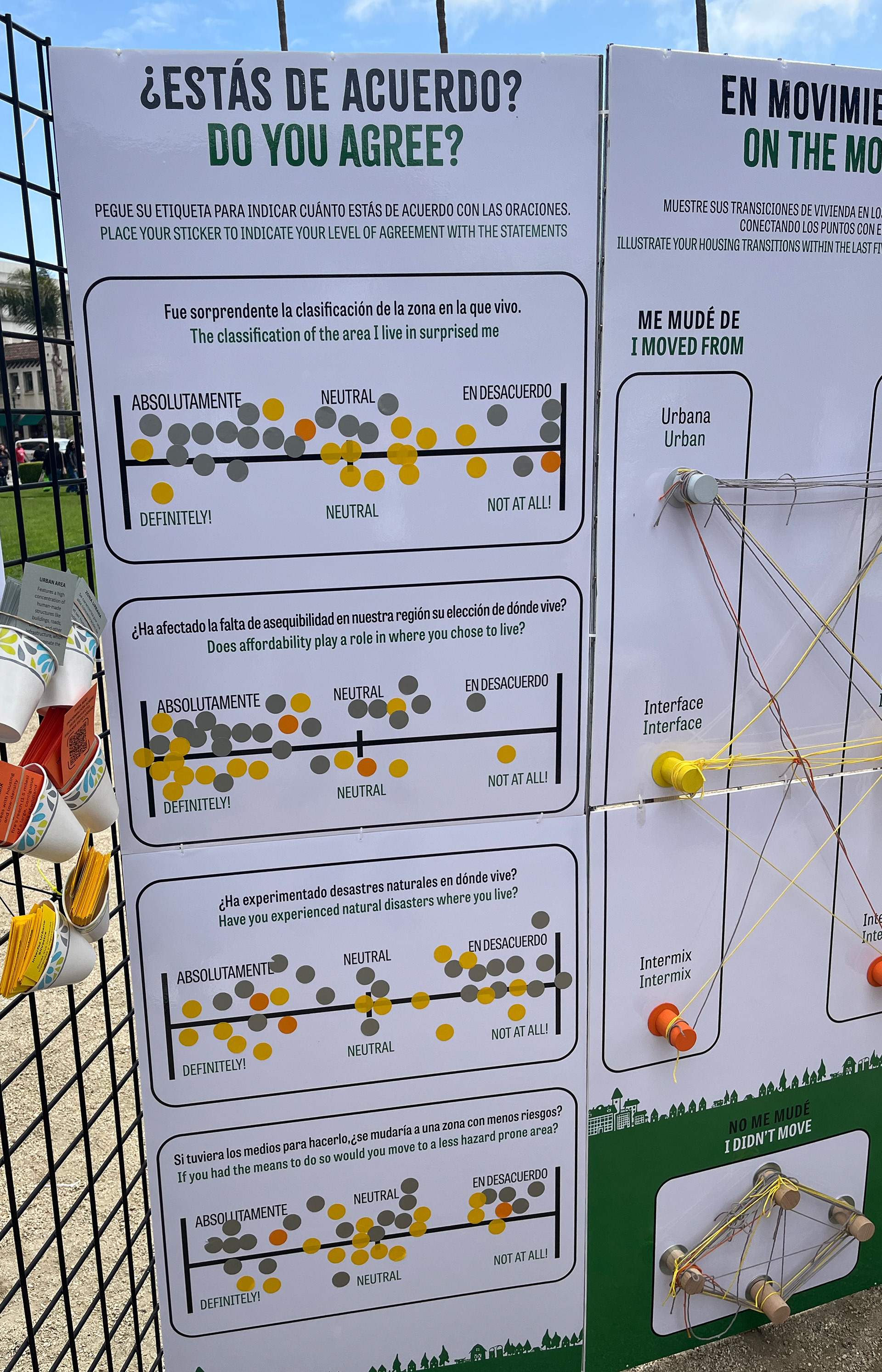
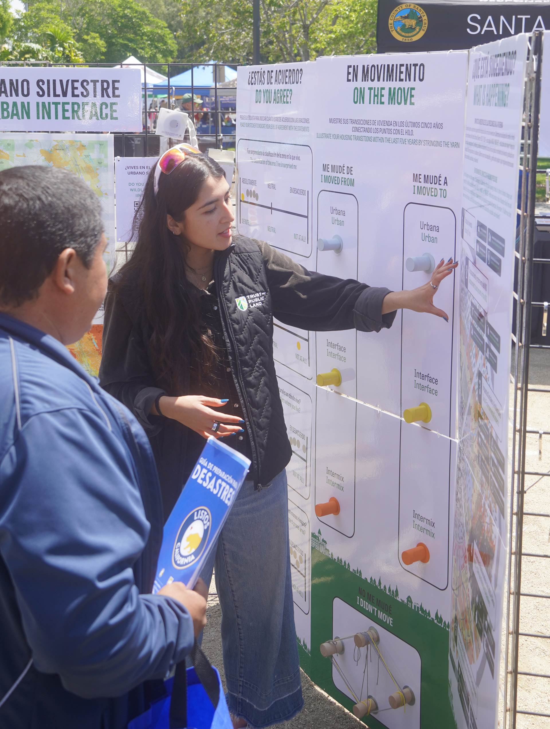
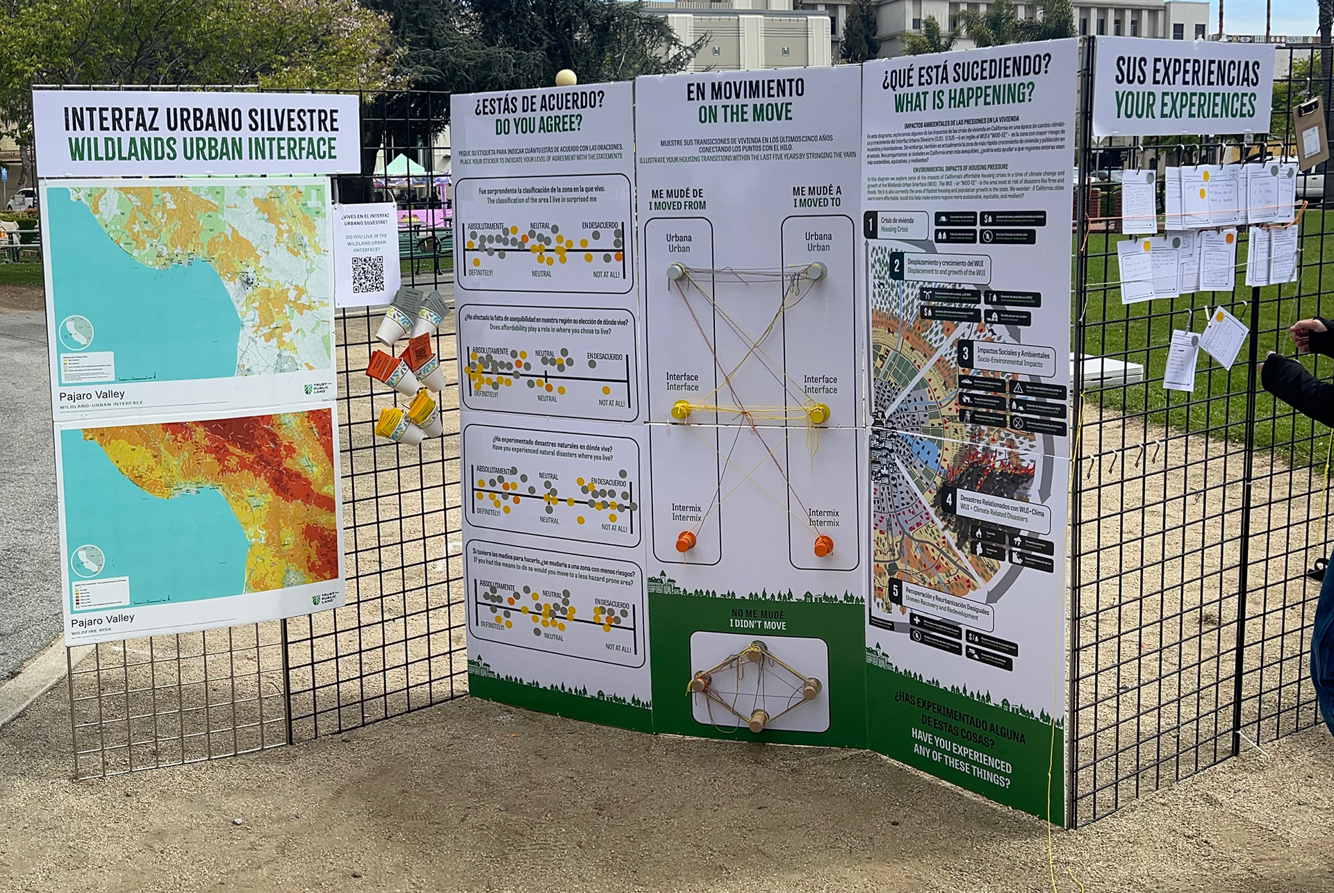
At the events themselves, I designed a system of four interactive display boards: a map showing WUI locations, a sliding scale survey board, a string-and-card connection diagram, and a card-sorting display. All were printed at large format and designed to be physically handled by attendees. Designing for live public interaction is a different discipline — everything has to be instantly legible from afar, durable enough for repeated handling, and intuitive enough to need no explanation.

WUI T-SHIRT
Client: UC Santa Cruz — CUES / WUI Project
Product: Staff t-shirt for Housing & Habitat Survey field team
Product: Staff t-shirt for Housing & Habitat Survey field team
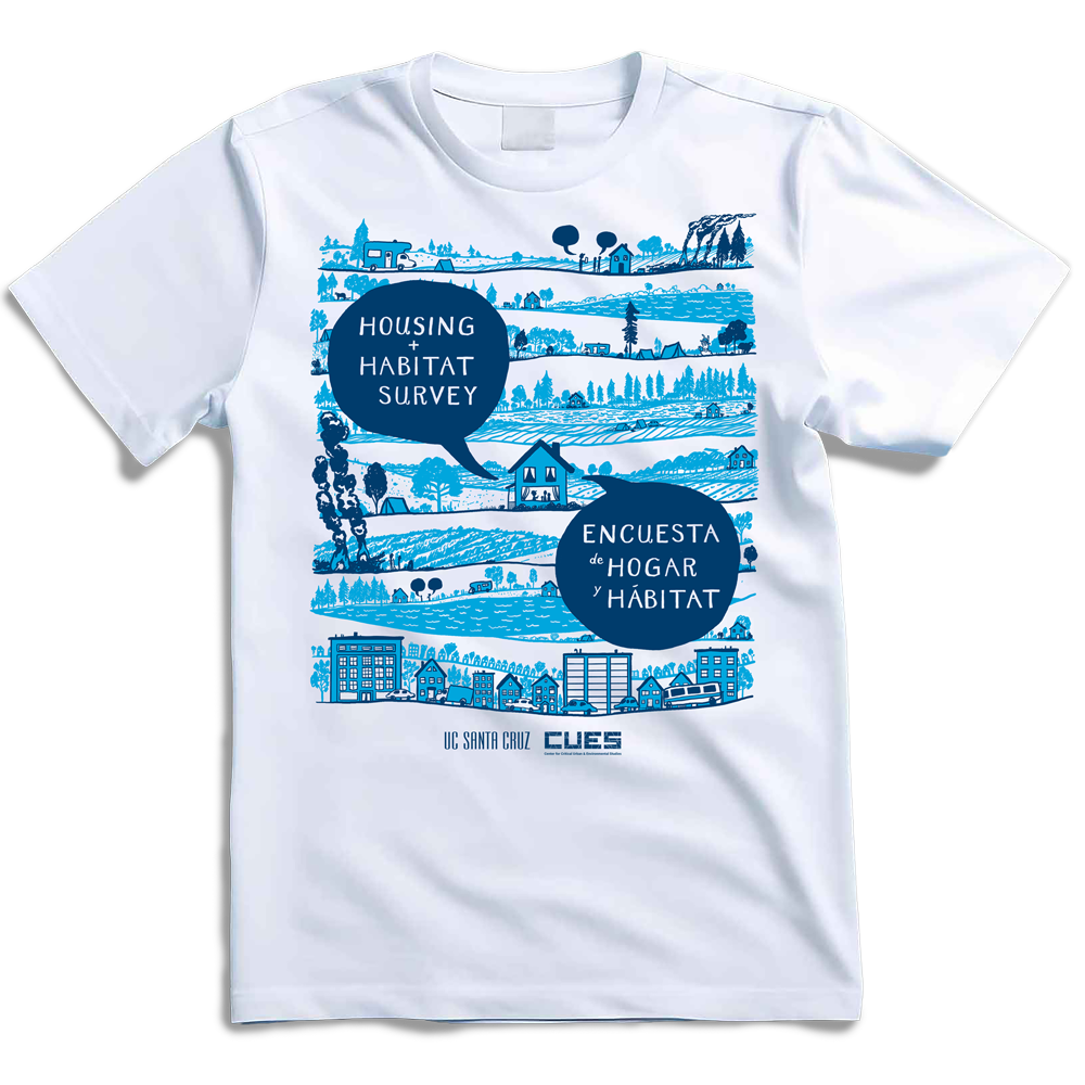
A small detail but a telling one: the CUES brand system extended all the way to the field researchers conducting surveys in WUI communities. The t-shirt gave the survey team a visible, unified identity that helped establish trust with community members they were approaching in public spaces.

UNGULATE PREDATION ILLUSTRATIONS
Client: UC Santa Cruz — Department of Ecology and Evolutionary Biology Product: Scientific illustrations for peer-reviewed research paper
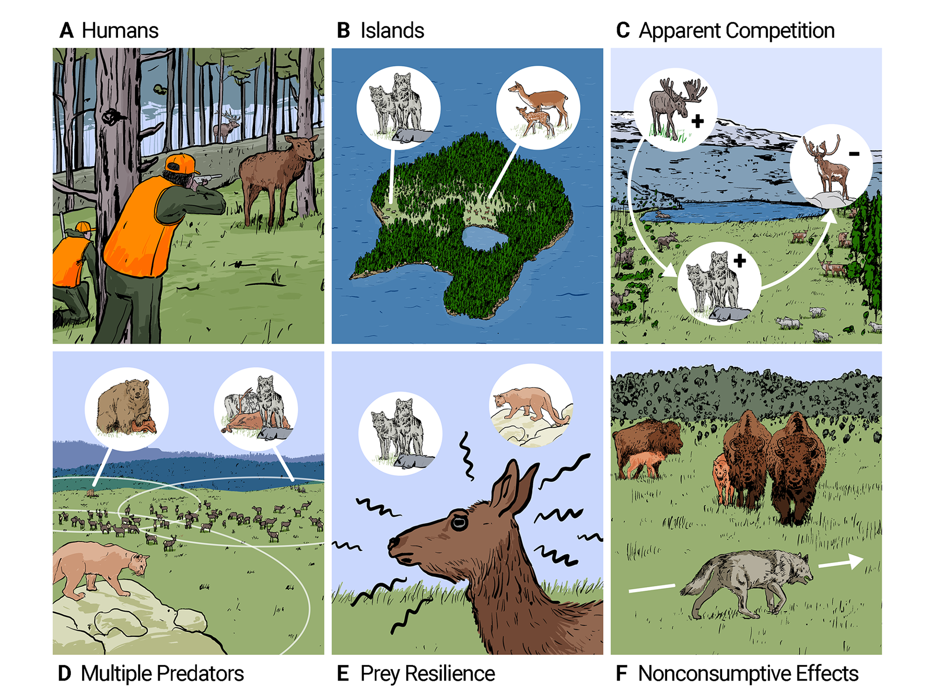
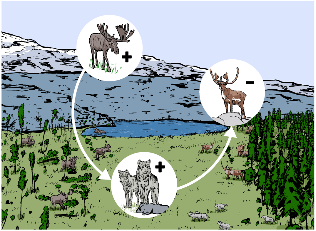
Meanwhile, in a different corner of the UCSC universe, I created these illustrations to accompany Professor Chris Wilmers' research paper on the ecological impacts of large carnivore recovery in North America. The brief was precise: visualize the mechanisms by which predators do or don't limit their ungulate prey populations, clearly enough that the diagrams could stand alongside the data in a peer-reviewed publication.
Scientific illustration demands a different kind of discipline than brand or campaign work — accuracy is non-negotiable, every visual decision has to serve the science, and there's no room for ambiguity. These were a genuine creative challenge and a satisfying one