A good logo does a specific job — it distills something complex into something instantly readable, and makes it look like the only possible answer. Getting there usually involves a lot of wrong turns first. These are three logo projects where I can show both the thinking and the result.

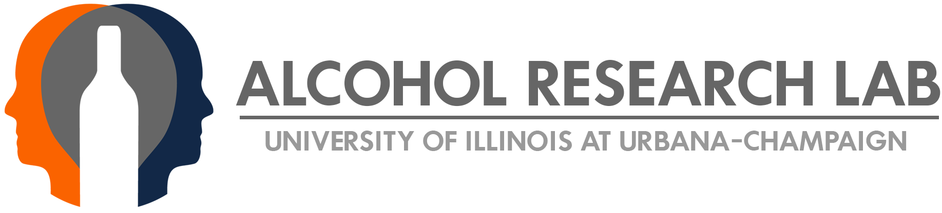
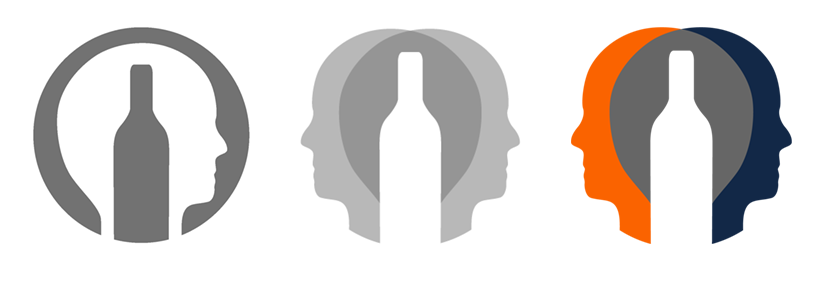
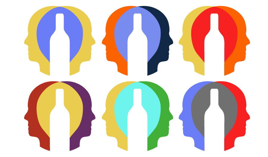
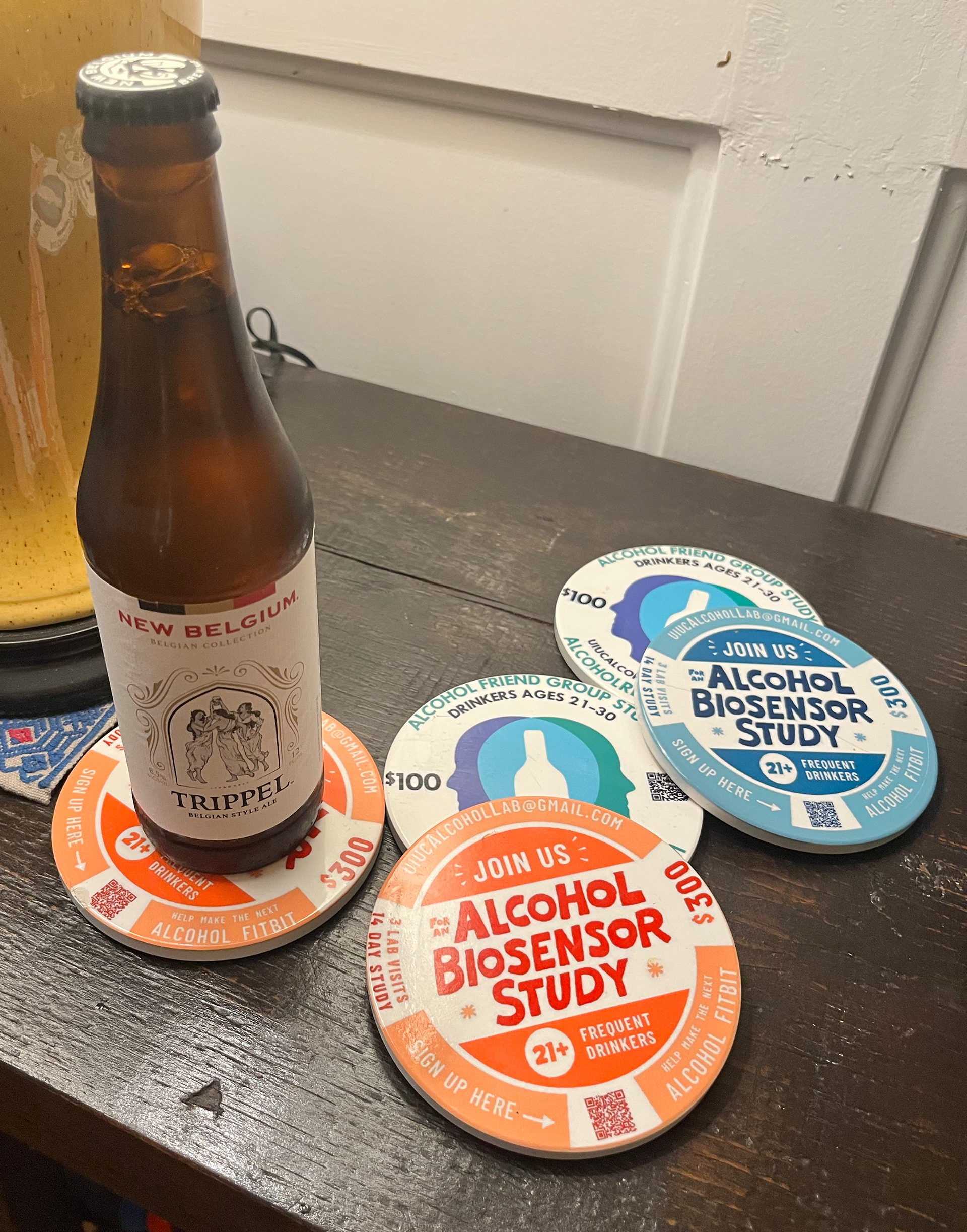
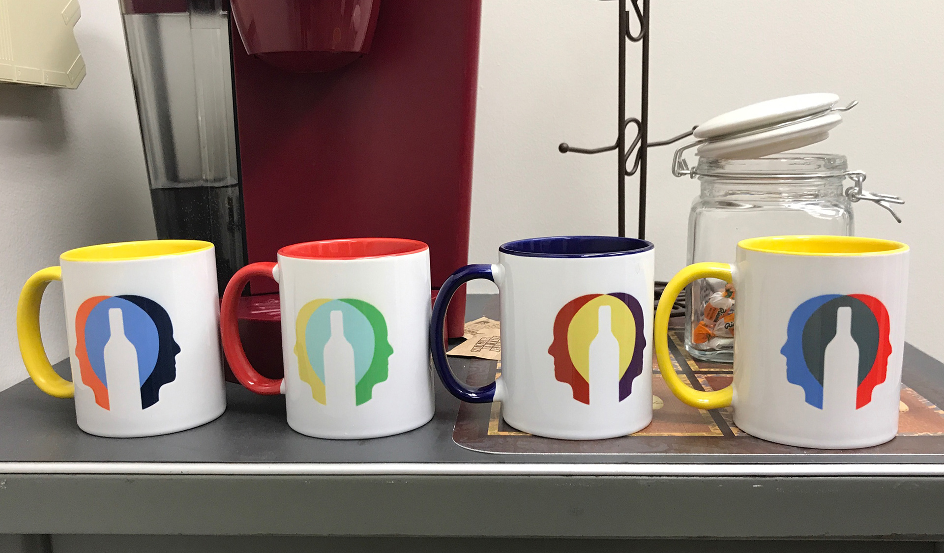
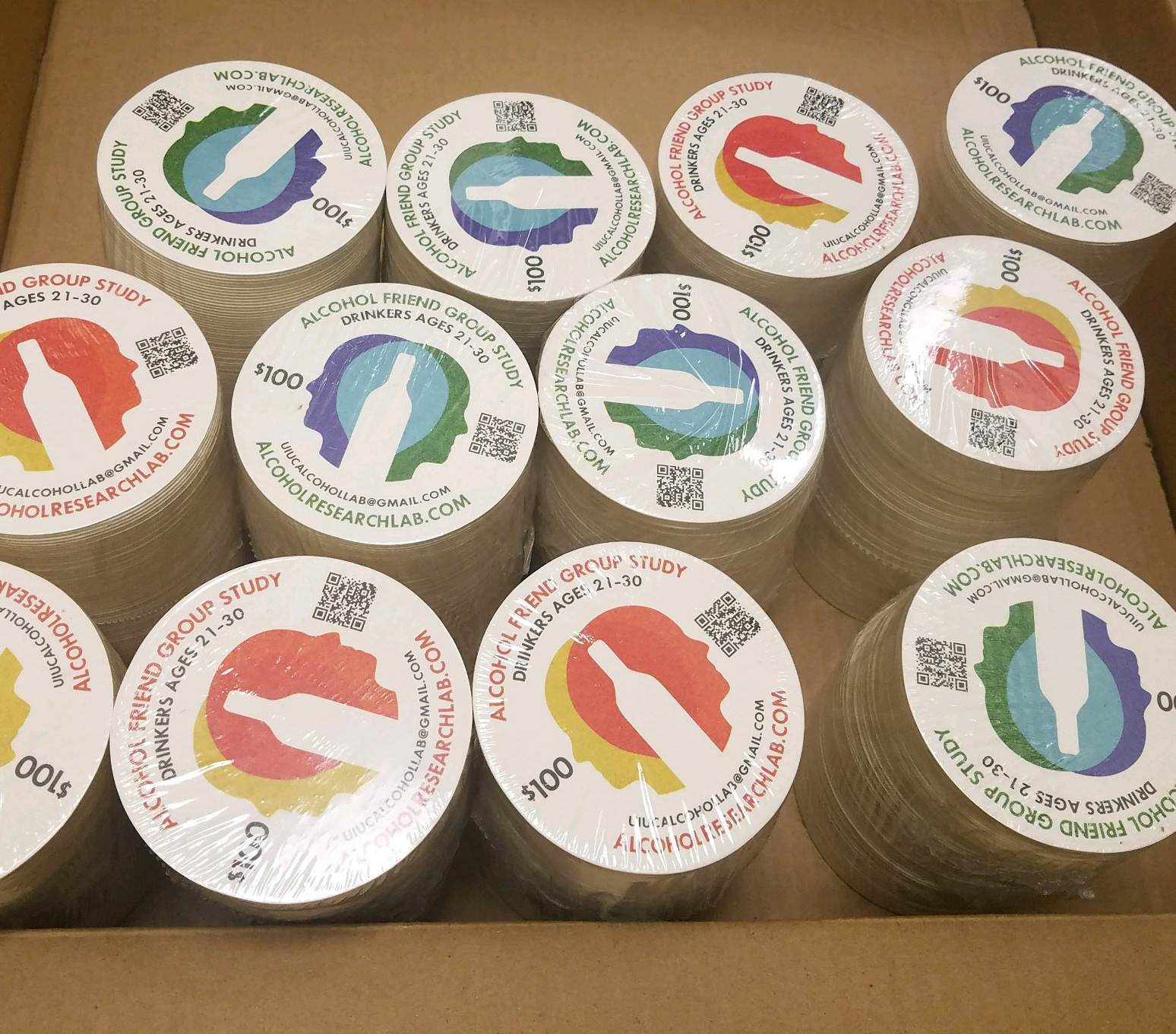
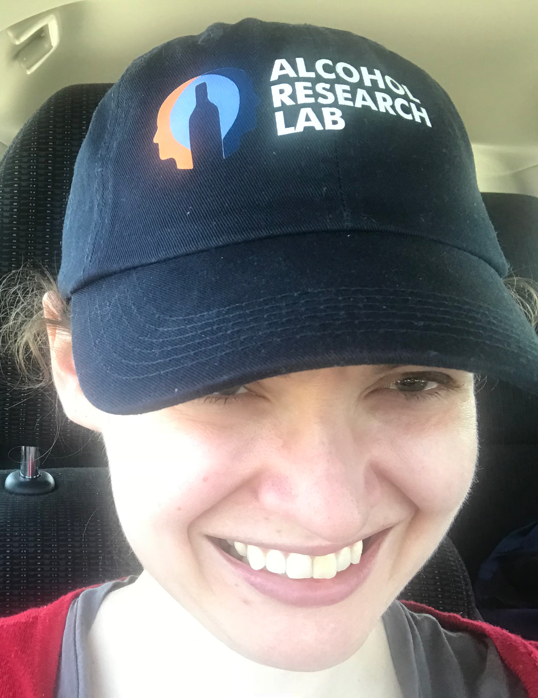
ALCOHOL RESEARCH LAB
Client: Alcohol Research Lab, University of Illinois
Product: Logo design, Related Merch
Product: Logo design, Related Merch
The Alcohol Research Lab studies alcohol's social, cognitive, and emotional effects on the brain. The brief was to make that legible in a single mark — which meant finding a way to represent not just alcohol and the brain, but the social dimension of the research that makes it distinctive.
My first attempts combined alcohol imagery with a single brain, but something felt missing — the social aspect wasn't there. Adding a second head changed everything. The two heads in conversation with each other captured the relational nature of the research in a way a single brain never could. Sometimes the right solution is just one element away.

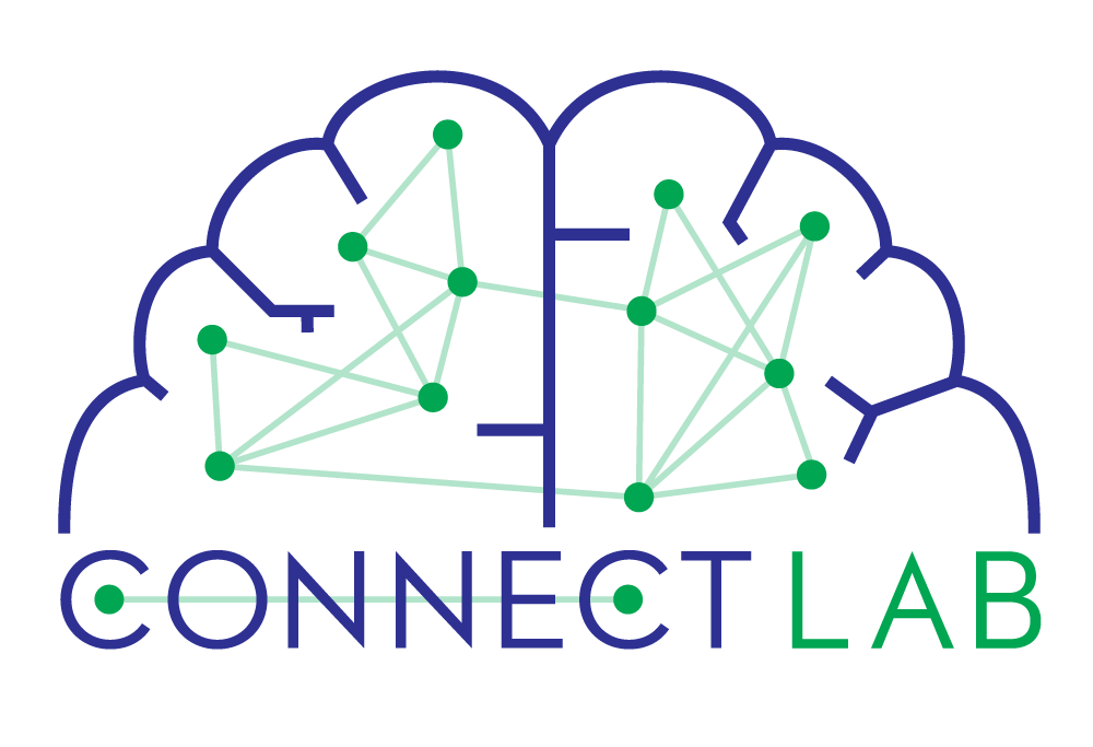
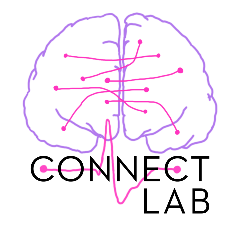
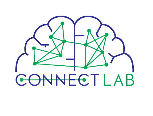
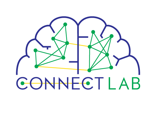
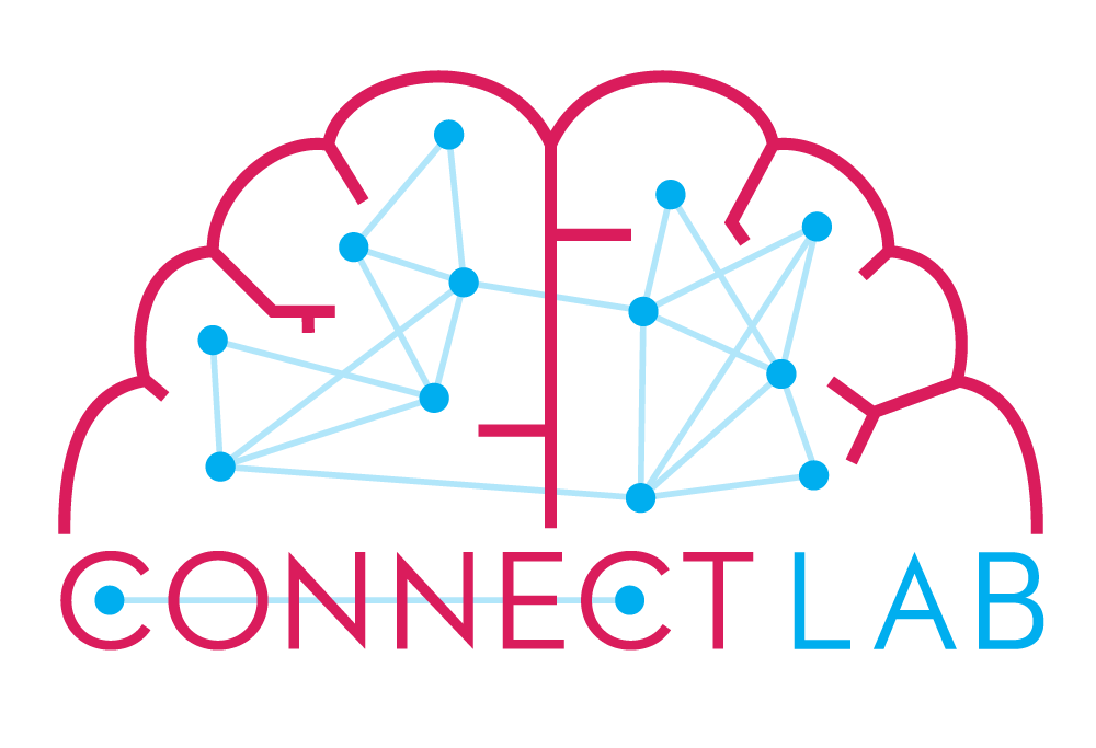
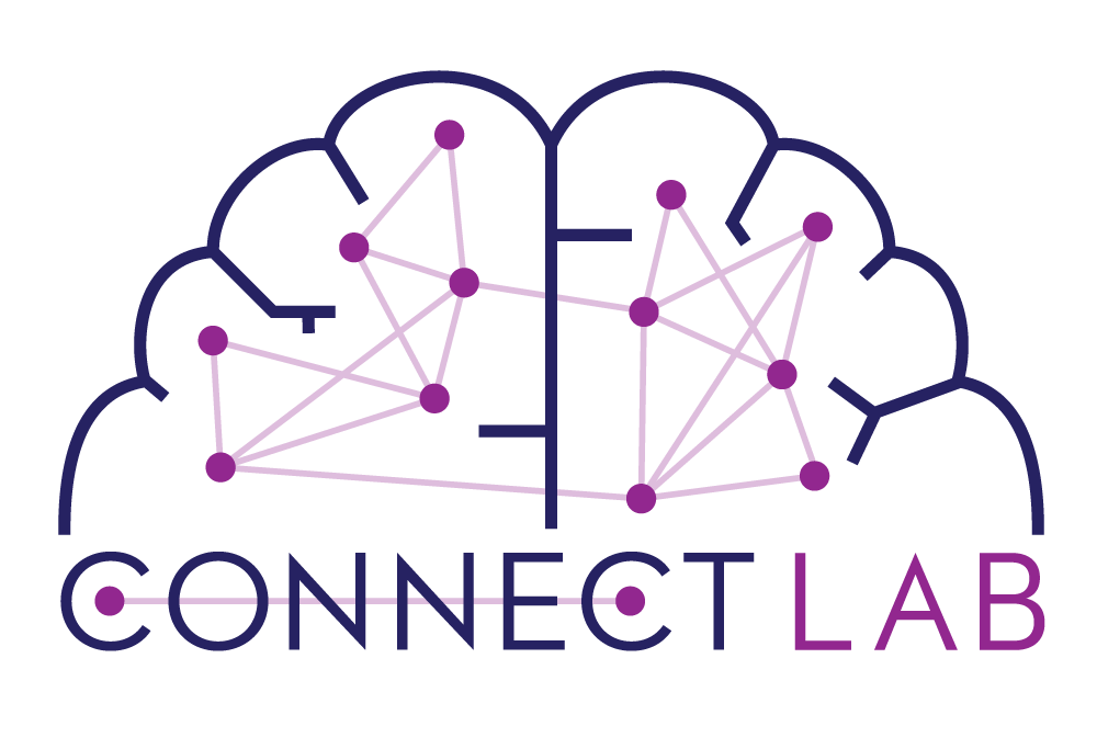
CONNECT LAB
Client: Connect Lab, University of Illinois
Product: Logo design
Product: Logo design
The Connect Lab studies spontaneous brain activity and the communication between brain regions — how different parts of the brain talk to each other, and what that means for cognitive control and behavior. The challenge was making something that felt scientific and precise without becoming a diagram.
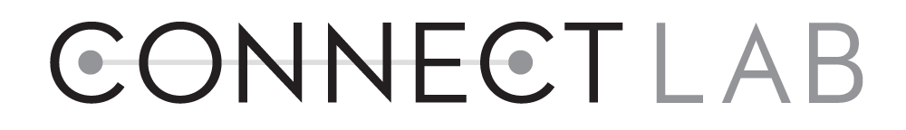
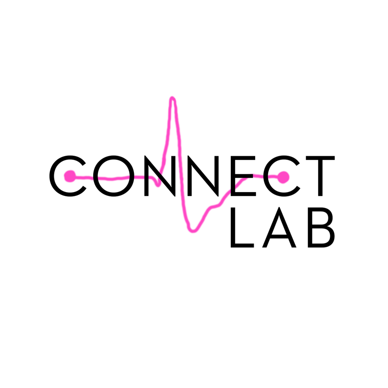
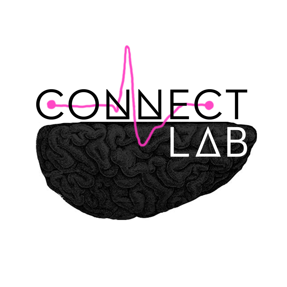
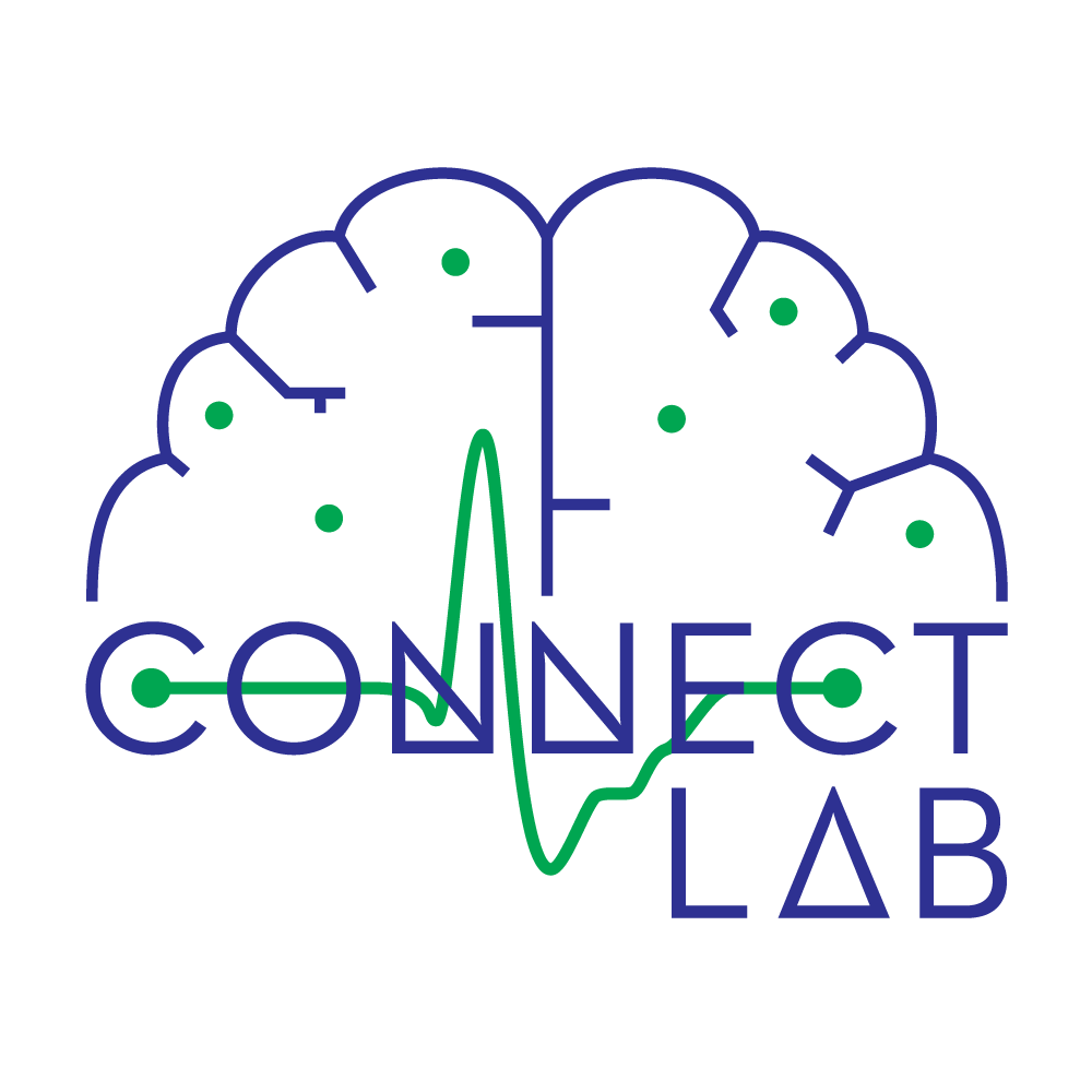
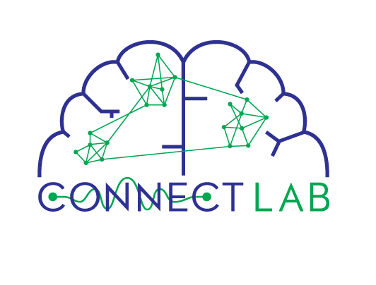
The process involved working through a range of ways to visualize neural connectivity — finding the balance between accuracy and elegance, and making sure the mark was clean enough to work at any size. The drafts below show how the concept developed before landing on a final version that feels both rigorous and alive.
The process involved working through a range of ways to visualize neural connectivity — finding the balance between accuracy and elegance, and making sure the mark was clean enough to work at any size. The drafts below show how the concept developed before landing on a final version that feels both rigorous and alive.

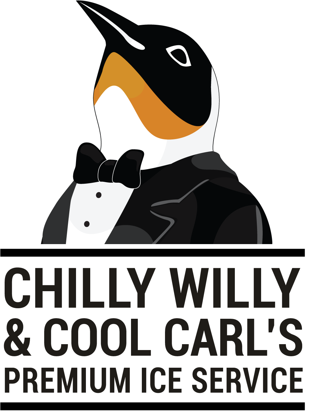
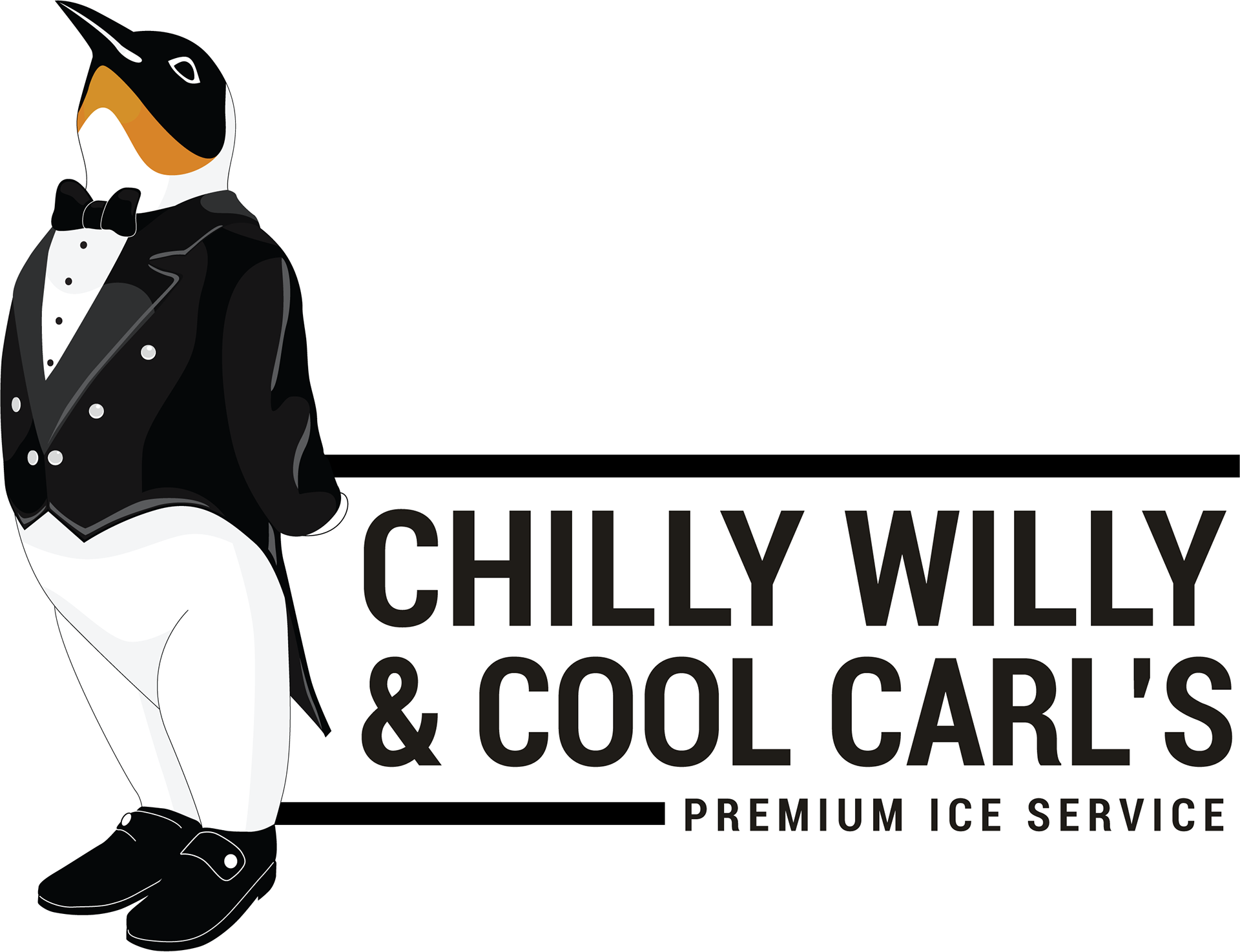
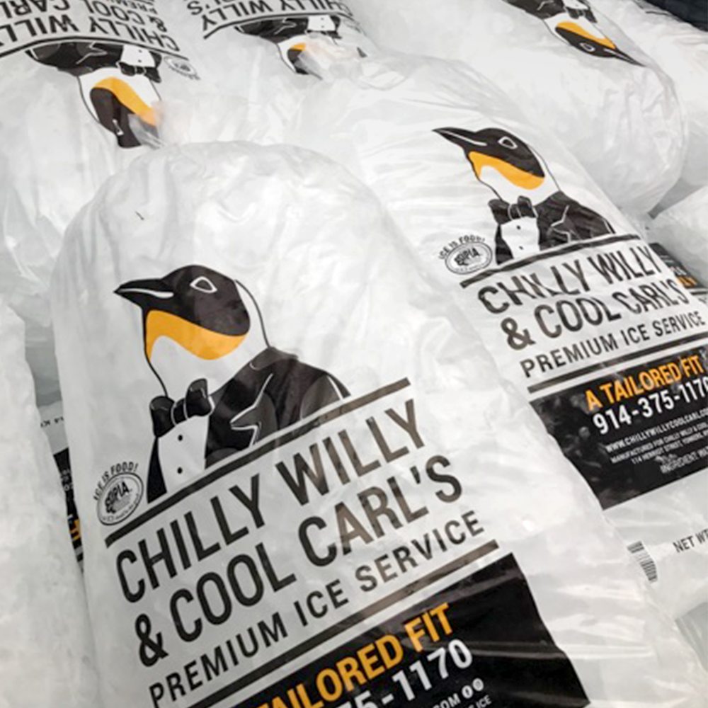
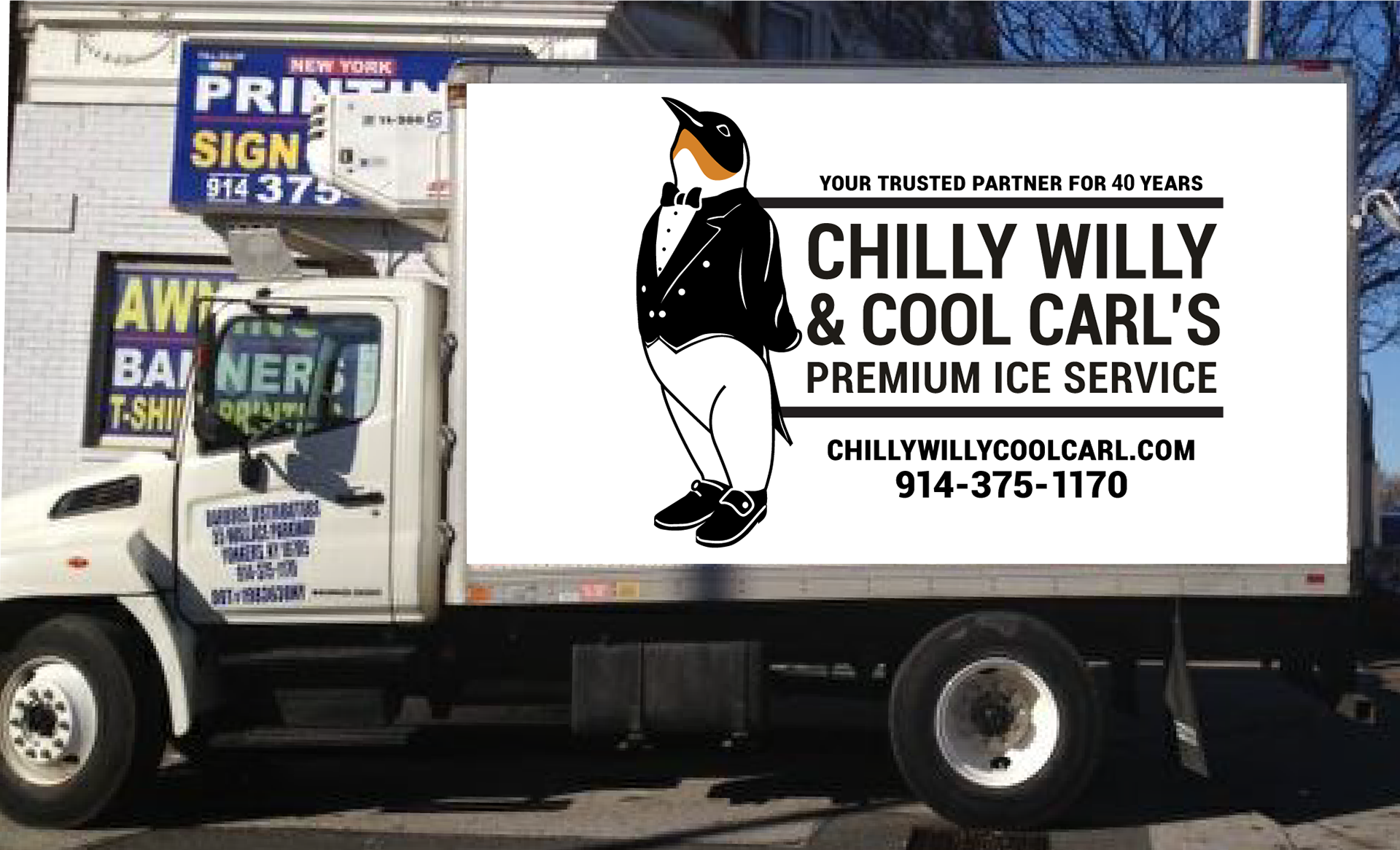
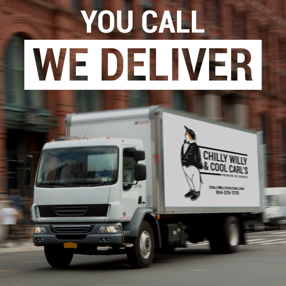
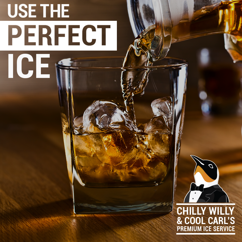
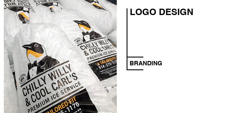
CHILLY WILLY & COOL CARL'S PREMIUM ICE SERVICE
Client: Chilly Willy & Cool Carl's, New York Product: Logo update and brand identity extension
A family-run ice service with a beloved penguin mascot that had simply gotten a bit dated. The brief wasn't to reimagine the brand — it was to honor what already worked while giving it enough of a refresh to feel current. That's a different kind of design challenge than starting from scratch: you have to understand what made the original loveable and preserve it while updating everything around it.
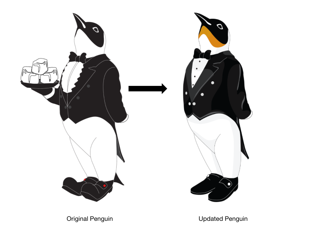
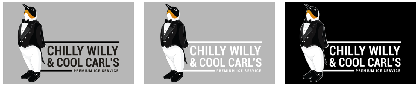
The refreshed penguin lives across bags of ice and delivery trucks, which meant thinking about how the mark holds up at very different scales and in very different contexts. A logo that works on a business card but falls apart on the side of a truck isn't finished yet.